
Mr Bagelman Identity
Mr. Bagelman — A craft-forward identity rooted in farmers market origins, handmade process, and simple ingredients.
Let’s Connect
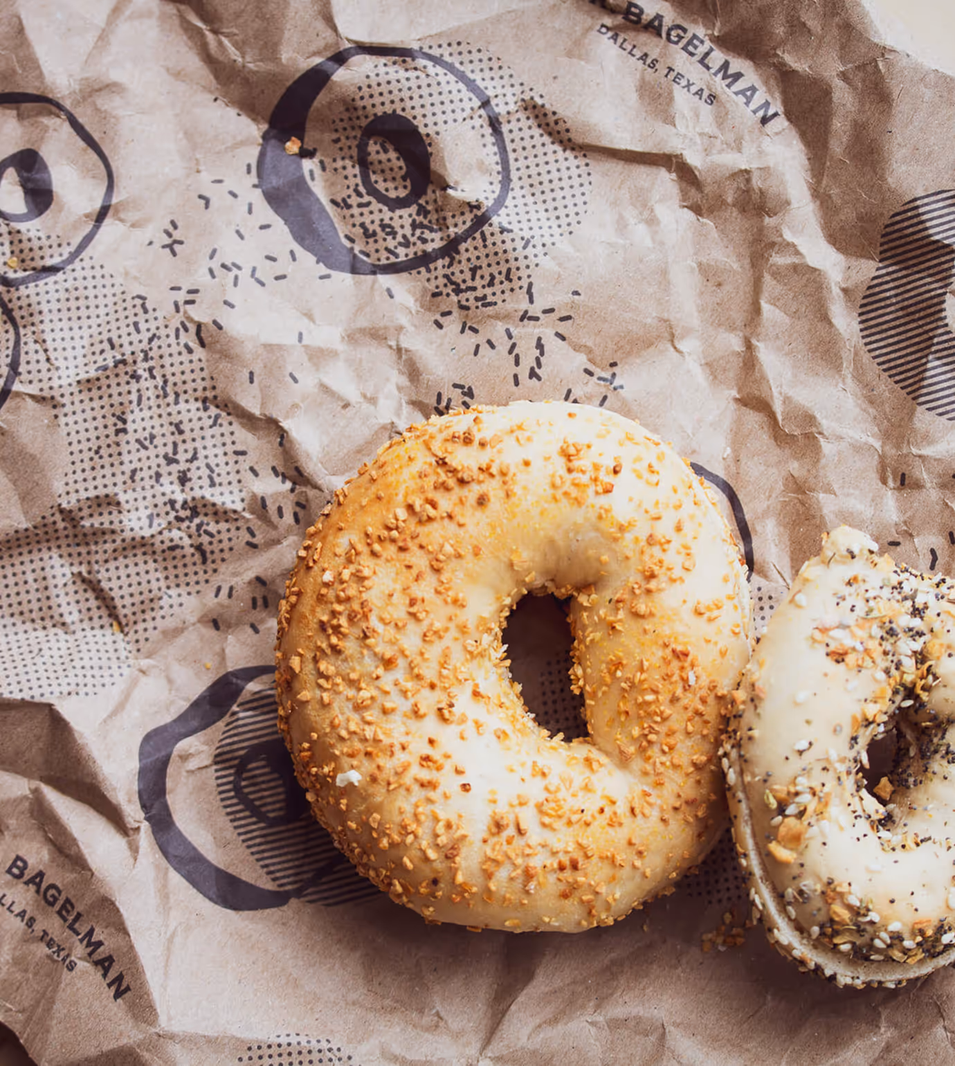
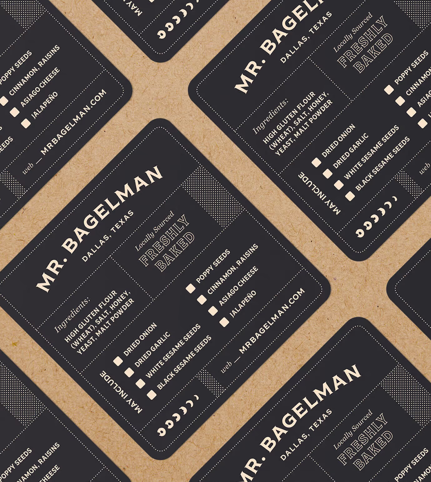
Mr. Bagelman began with humble roots — selling fresh, handmade bagels at local farmers markets. From the beginning, the brand was built on quality ingredients, small-batch production, and a desire to connect directly with customers. The goal was to create a visual identity that honored those beginnings while giving the brand a distinctive, own-able presence that could scale beyond the market booth.
Client
Mr. Bagelman
Services
Creative Direction
Brand Identity Design
Print Collateral
Packaging
Year
June
2018


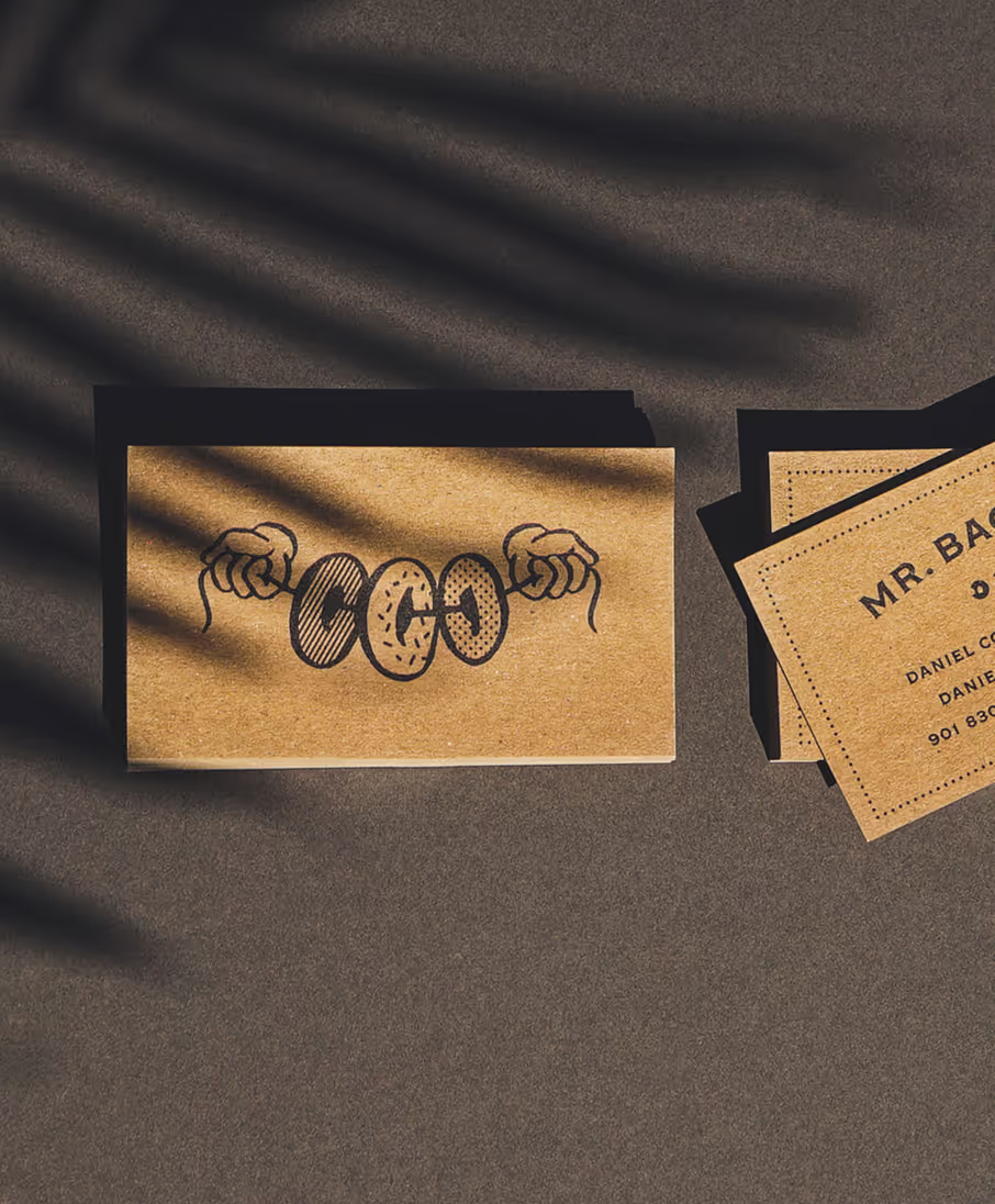
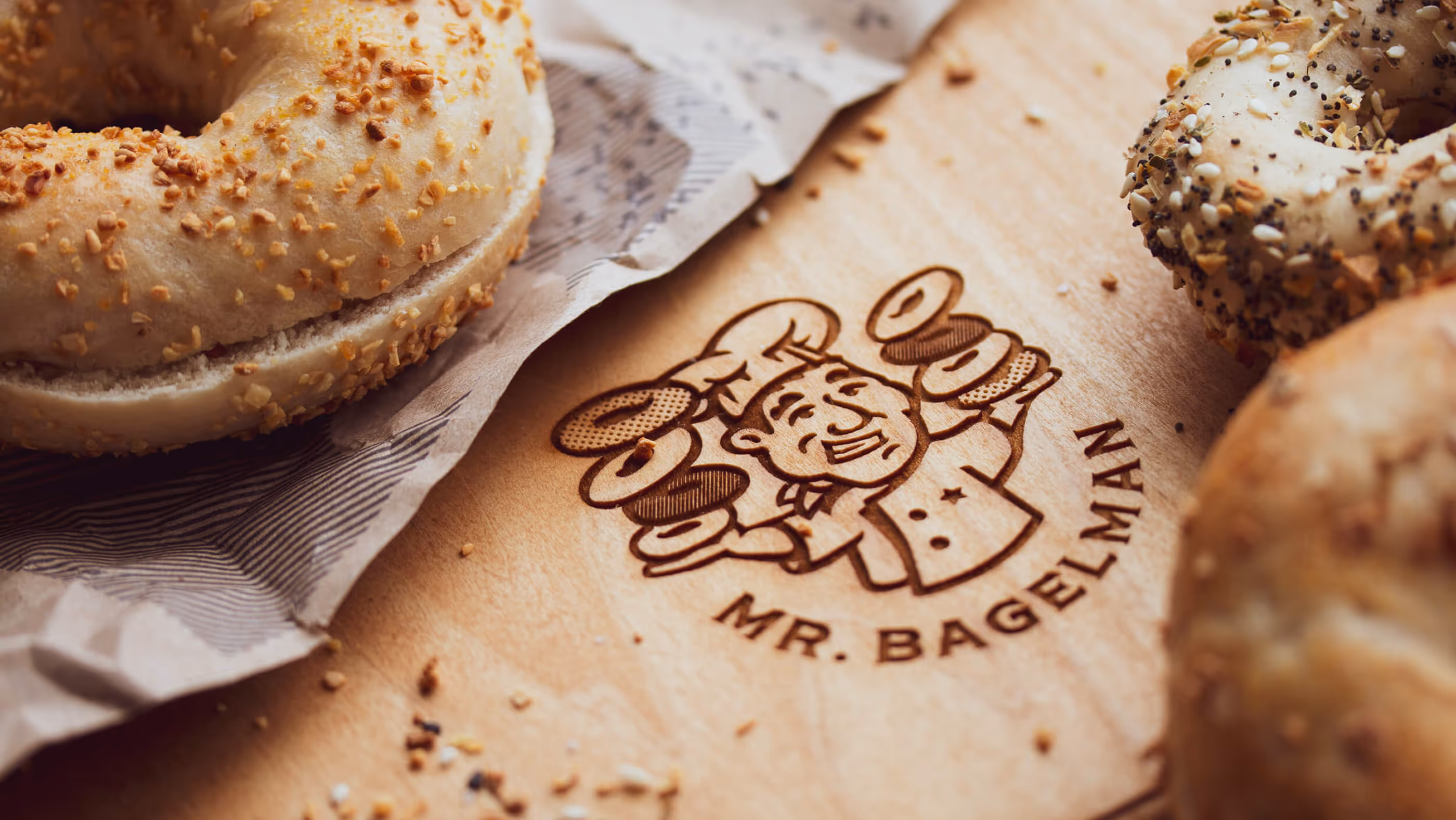
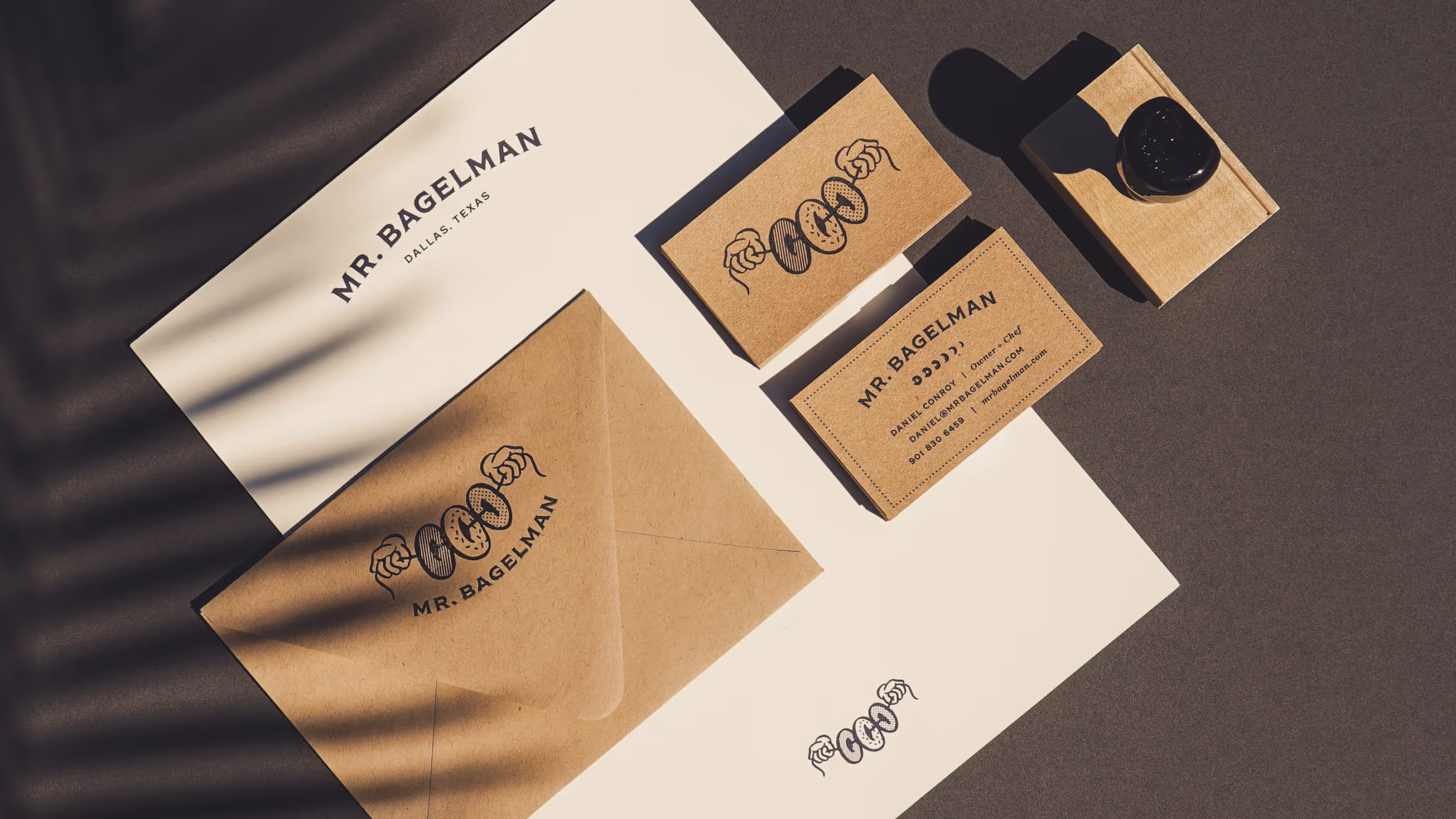
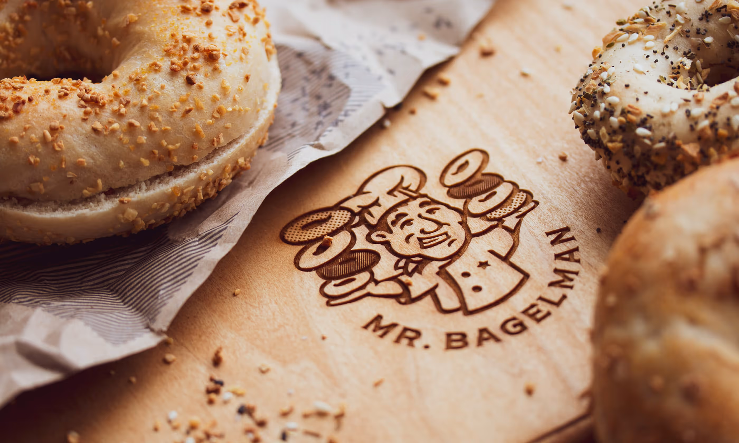
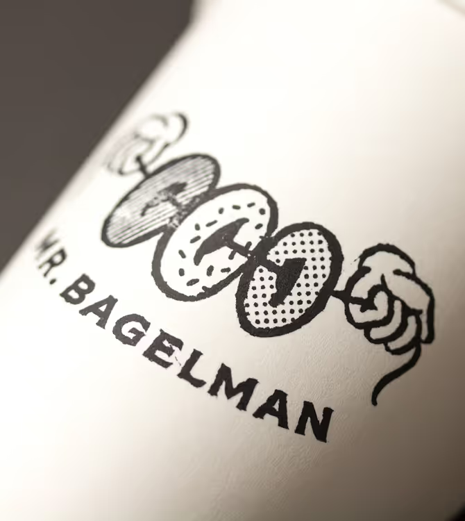
The central logo mark comes directly from the founder’s original farmers market vision of stringing bagels across his booth to attract customers. That simple idea became the heart of the brand. The hands signal craft and care, while the bagels act as both product and visual hook, telling the origin story in a single, memorable image.

The resulting identity leans heavily into craft, simplicity, and story. Reflecting not only how the bagels are made, but how the brand first came to life.
The Hands Story
The illustrated mark is inspired by the the founder’s desire to string up bagels over his farmers market booth to attract customers.

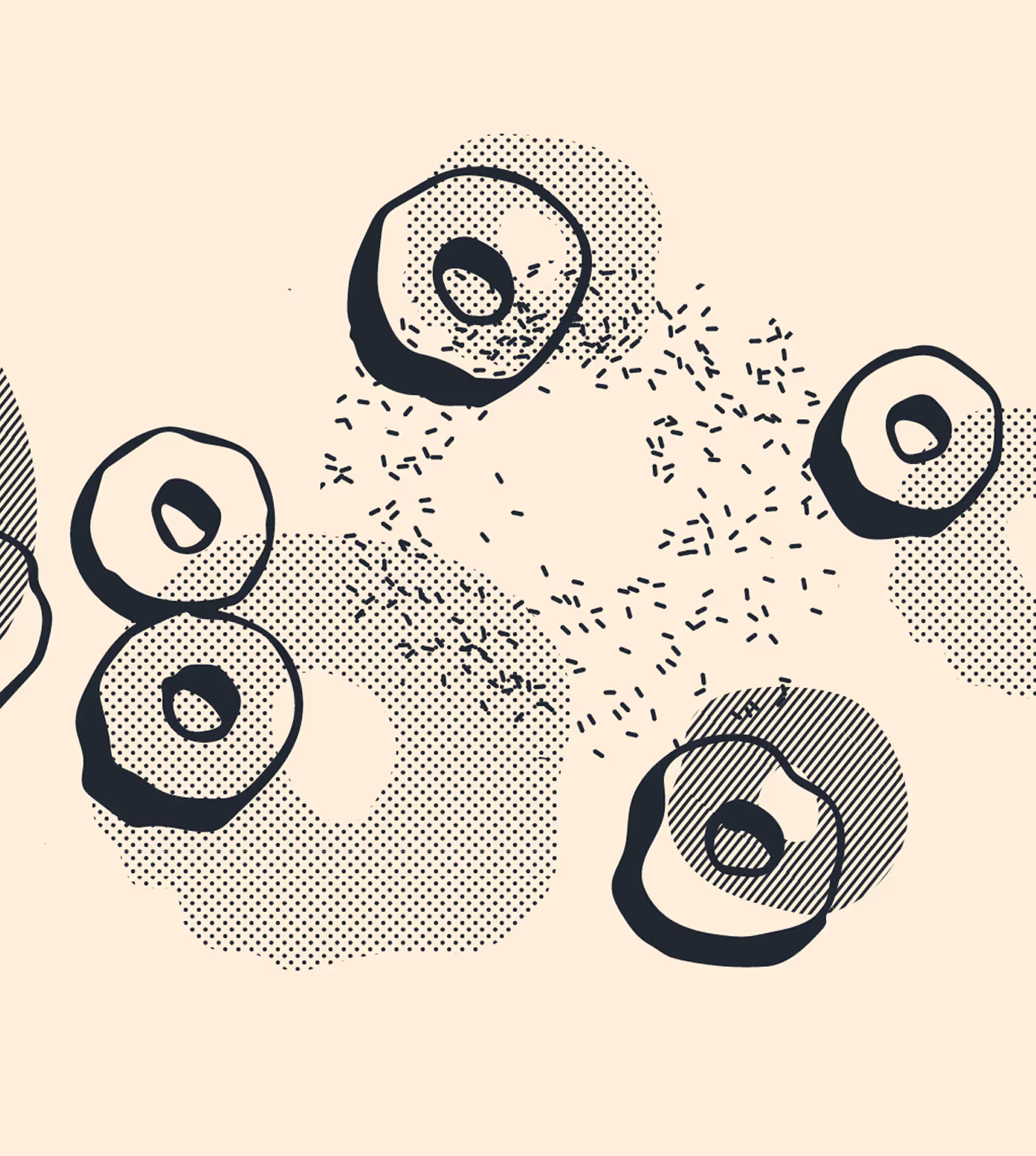
Craft-Forward
We mimicked his use of limited, quality ingredients with a very minimal color pallet and a variety of halftone patterns