
Do Vitamins Packaging Design
Do Vitamins, a boutique supplement brand in ultra-clean sports nutrition for ingredient-conscious athletes, sought to elevate its brand and packaging.
Let’s Connect
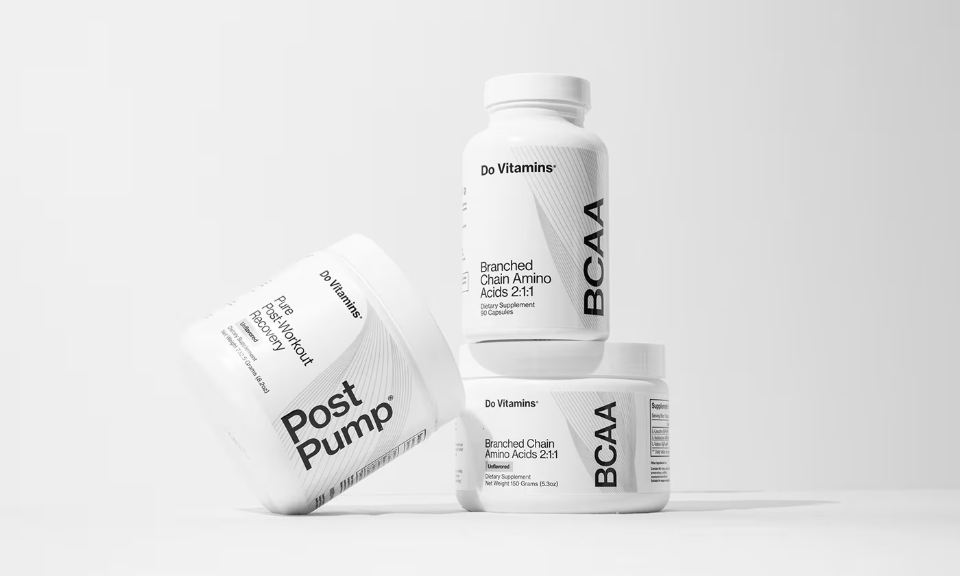
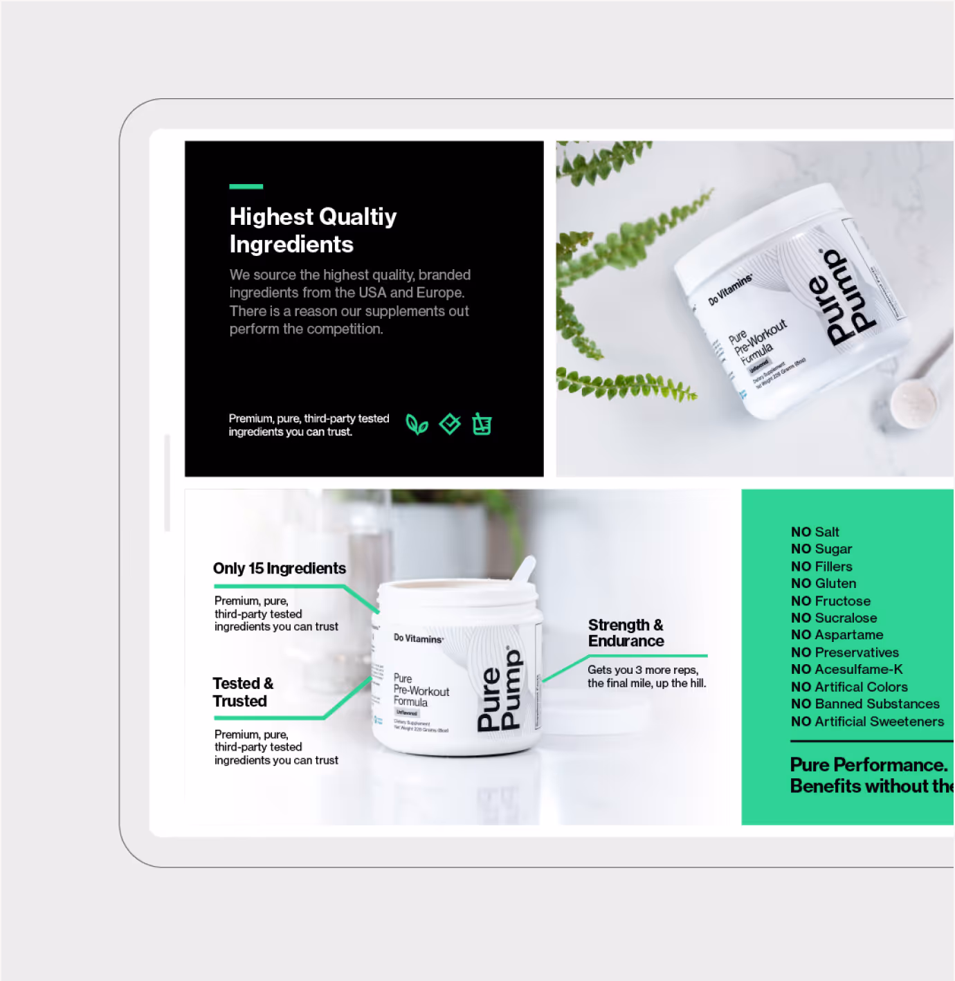
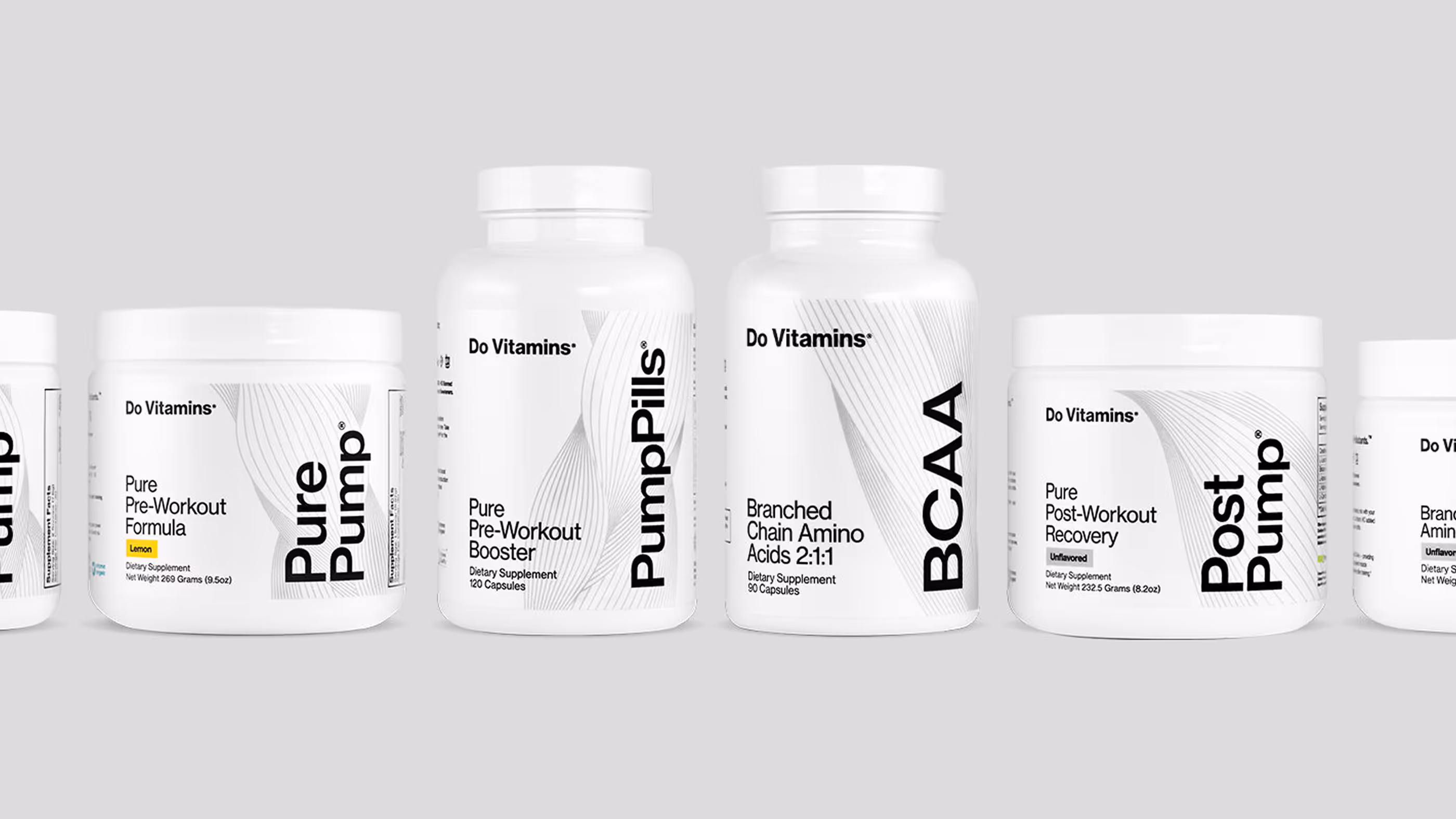
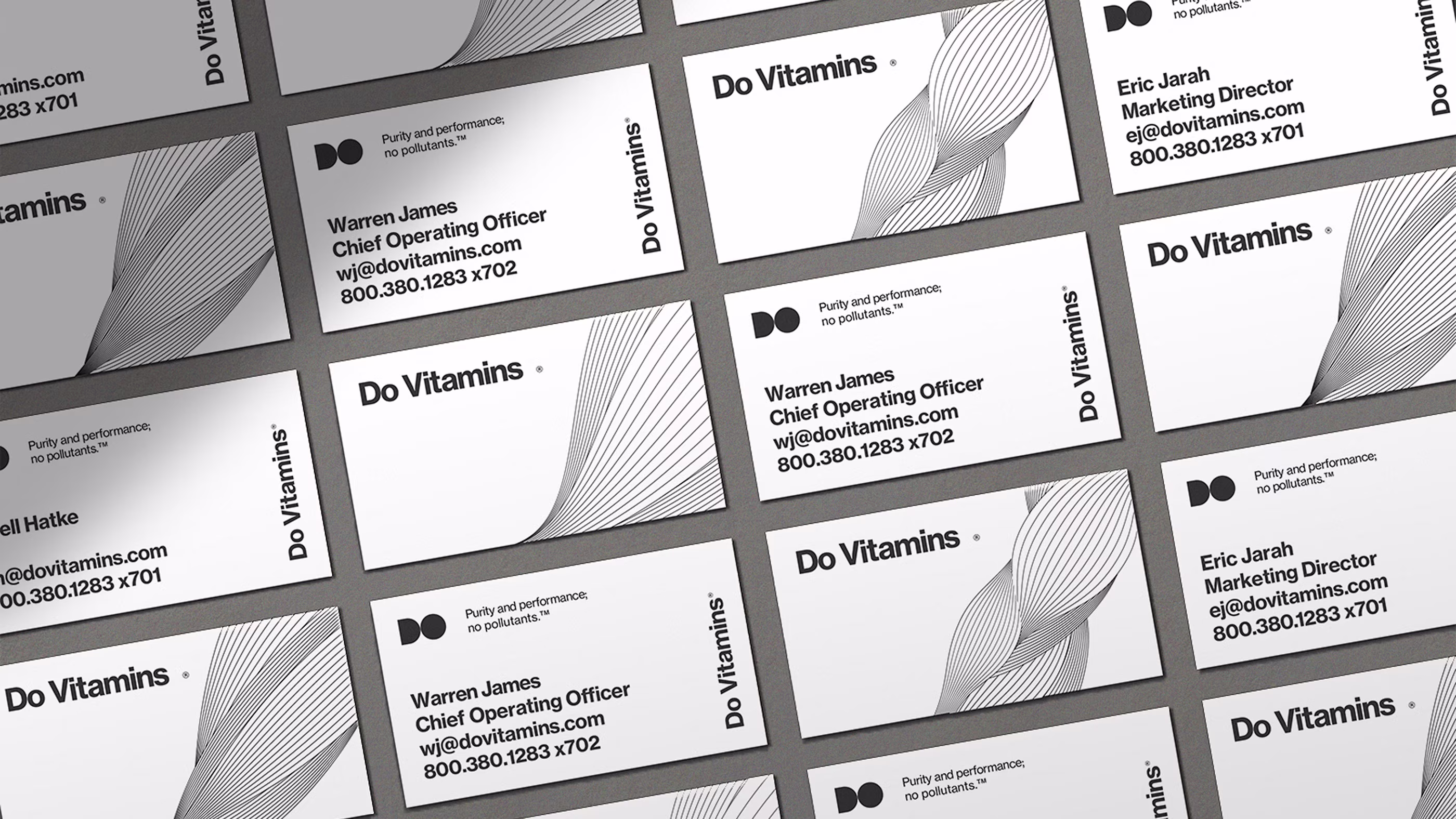
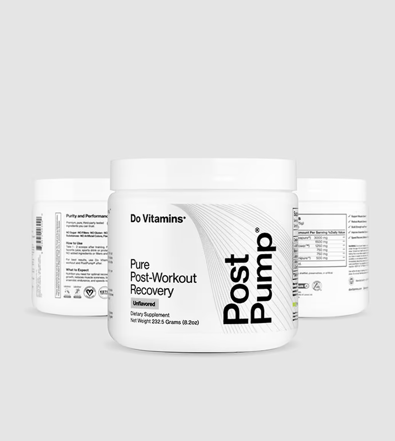
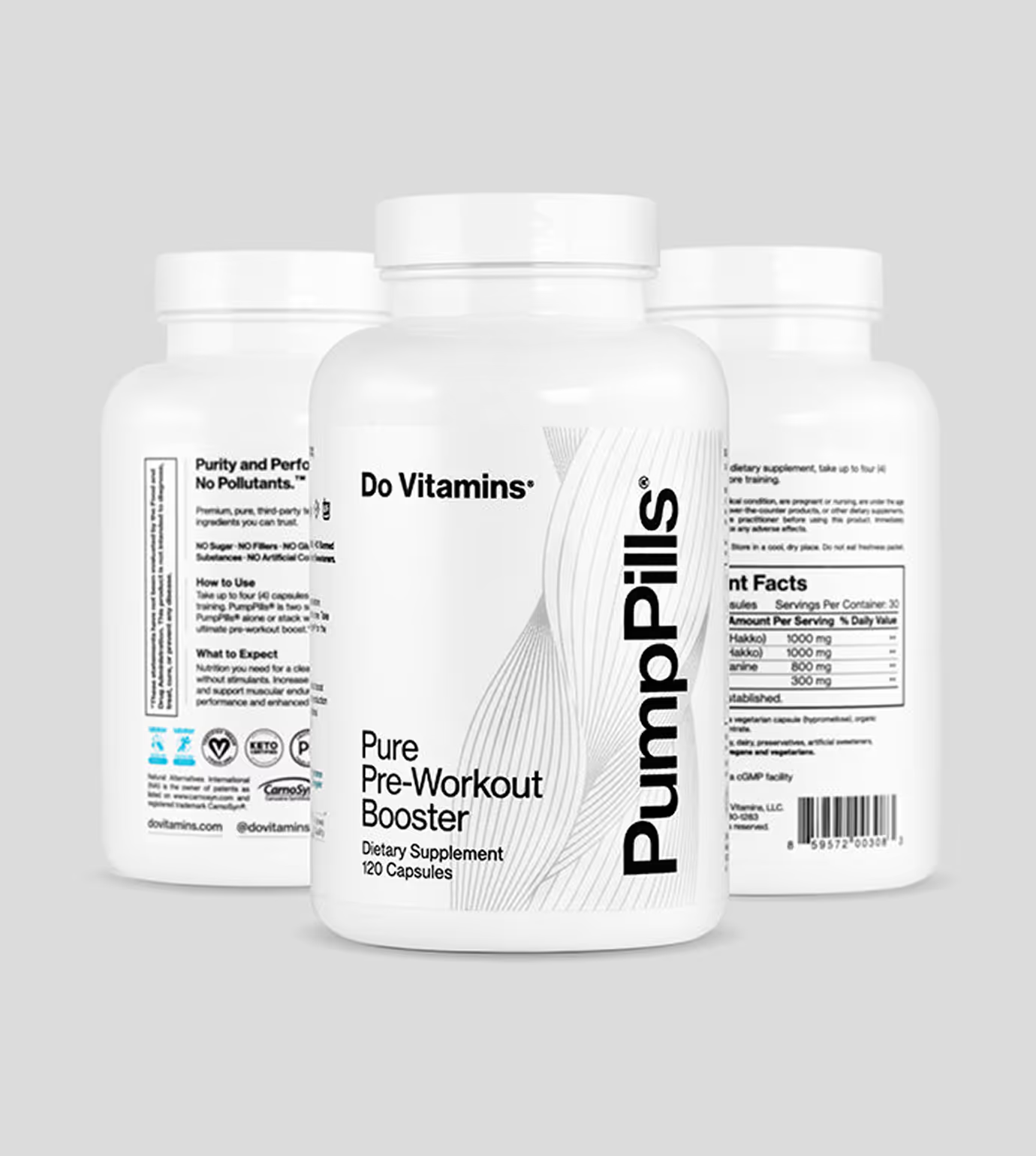
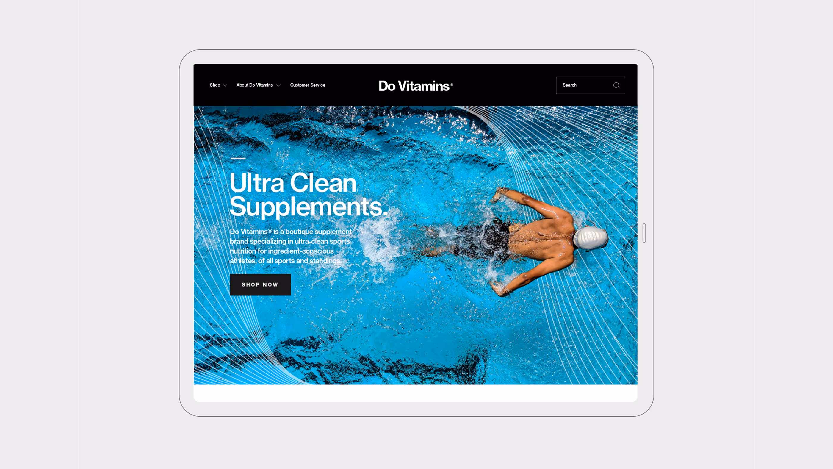
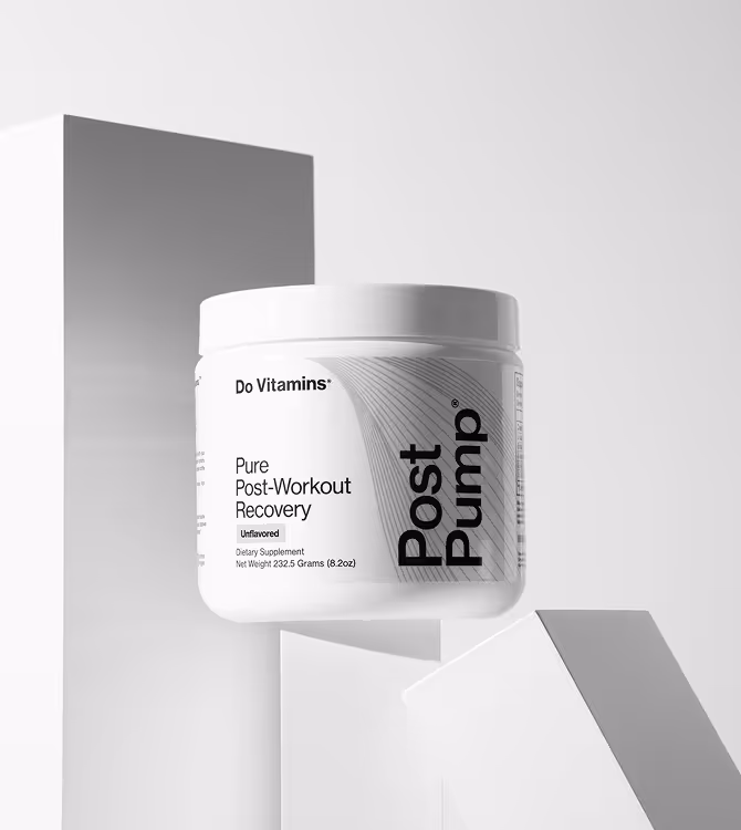
Our challenge was to design a visual identity that clearly reflected Do Vitamins’ commitment to ultra-clean, scientifically studied ingredients while appealing to a broader audience. We created a more gender-neutral, minimal aesthetic supported by intricate, textural muscle-fiber illustrations to establish a consistent and recognizable visual language across the entire product line.
Client
Do Vitamins Supplements
Services
Packaging Design
Product Photography
Year
January
2018
Links
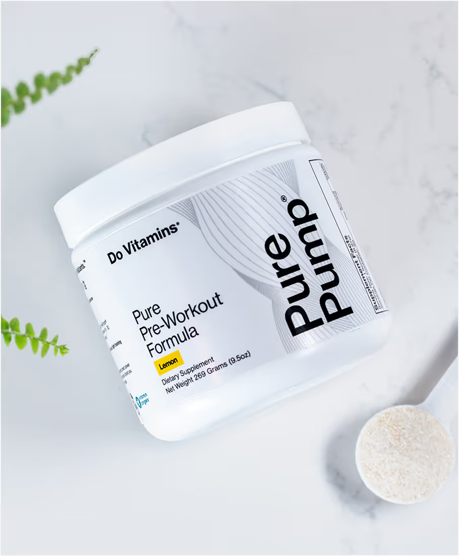
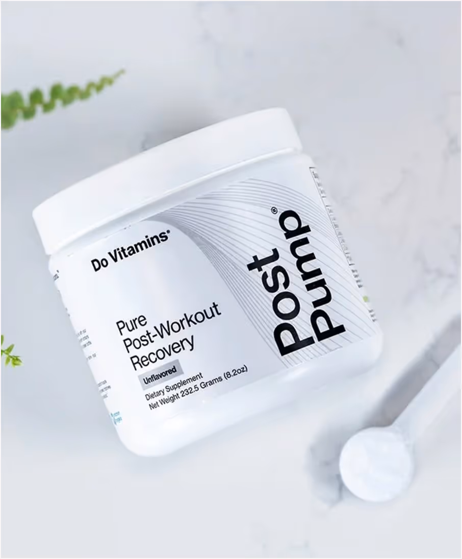
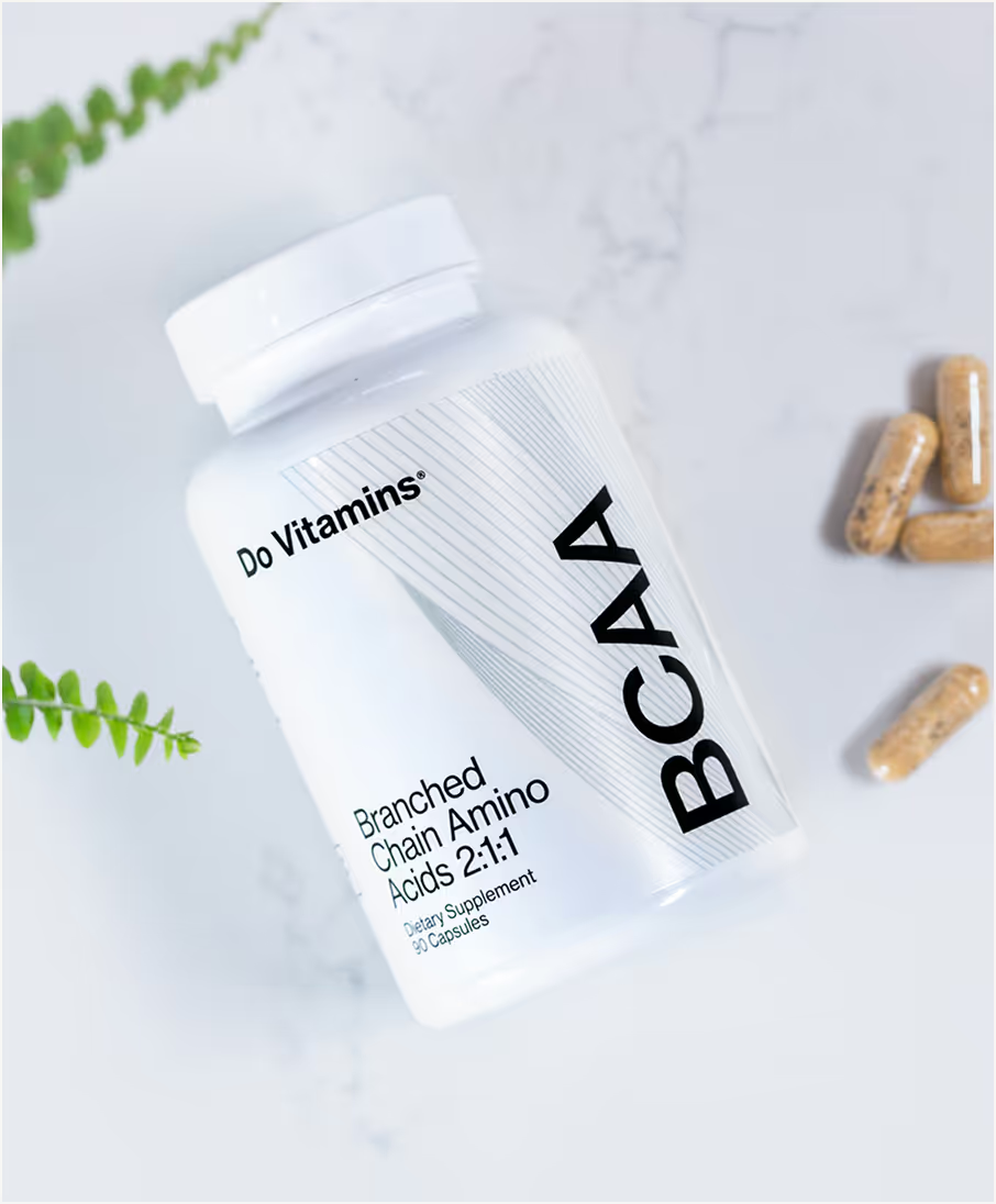
I reimagined the brand with a gender-neutral direction while preserving the light and minimal aesthetic that aligns with the purity of their products. This balance allowed the identity to feel both modern and inclusive without losing the brand’s established simplicity.
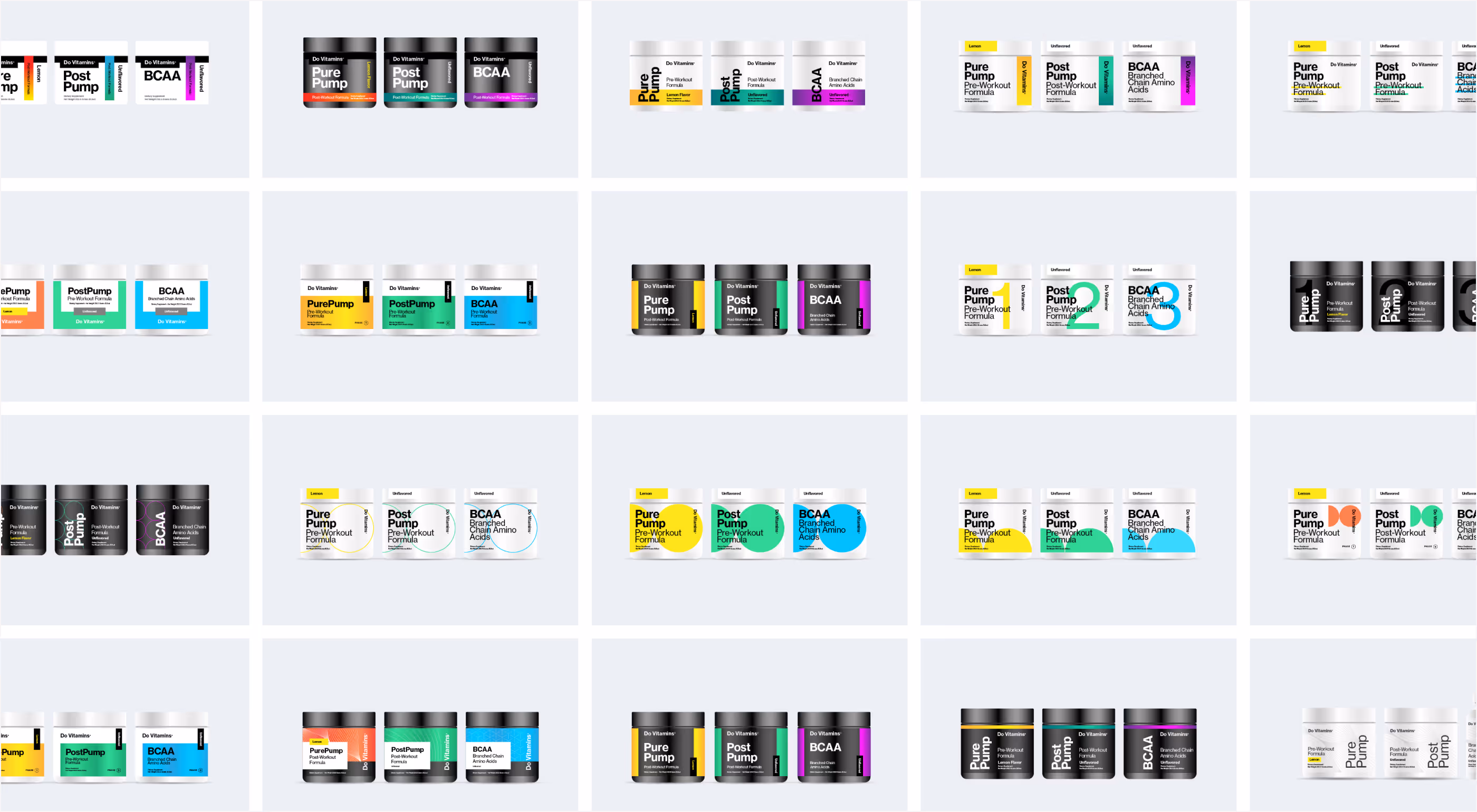
To reinforce this vision, I developed intricate, textural muscle-fiber illustrations that run consistently across the product line. These details created a recognizable visual language, tying every element back to the brand’s foundation of science and strength.

Concept
The concept centers on purity and performance expressed through minimal design and subtle detail.

The result
The result is a packaging identity that feels timeless, versatile, and directly connected to the brand’s core values.