
Inooko Identity
Inooko - Bringing warmth, personality, and pet-centric charm to a French lifestyle brand
Let’s Connect
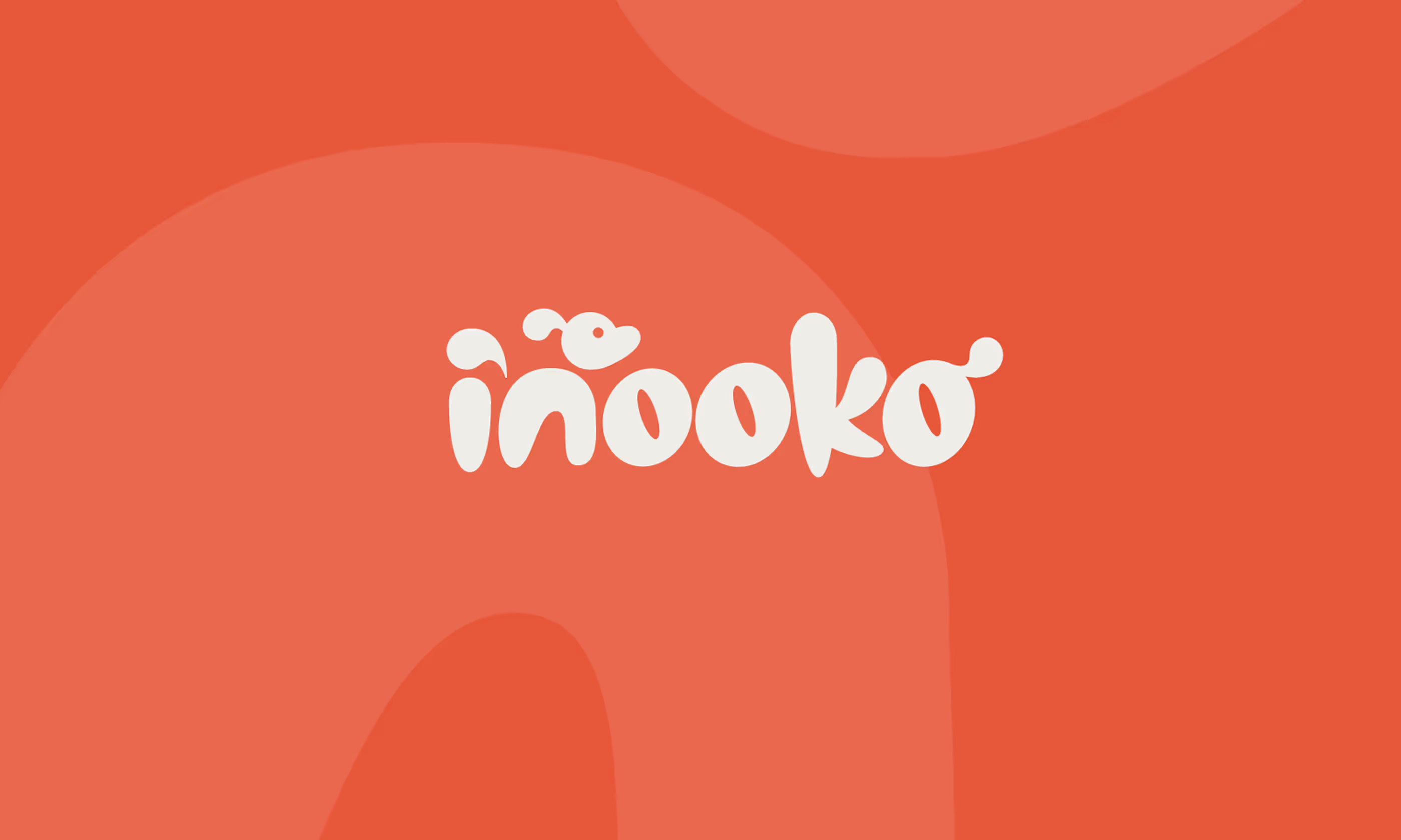
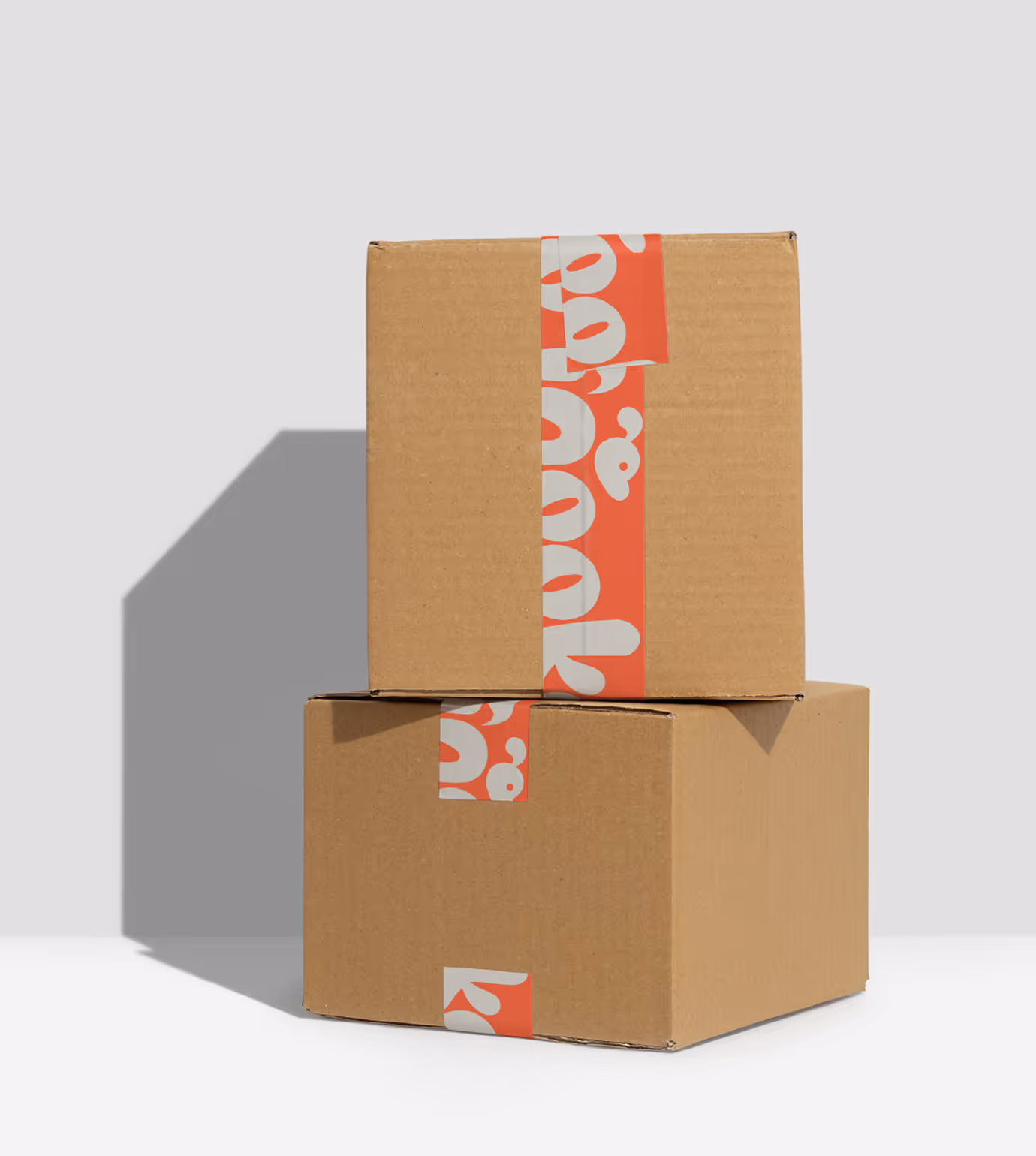
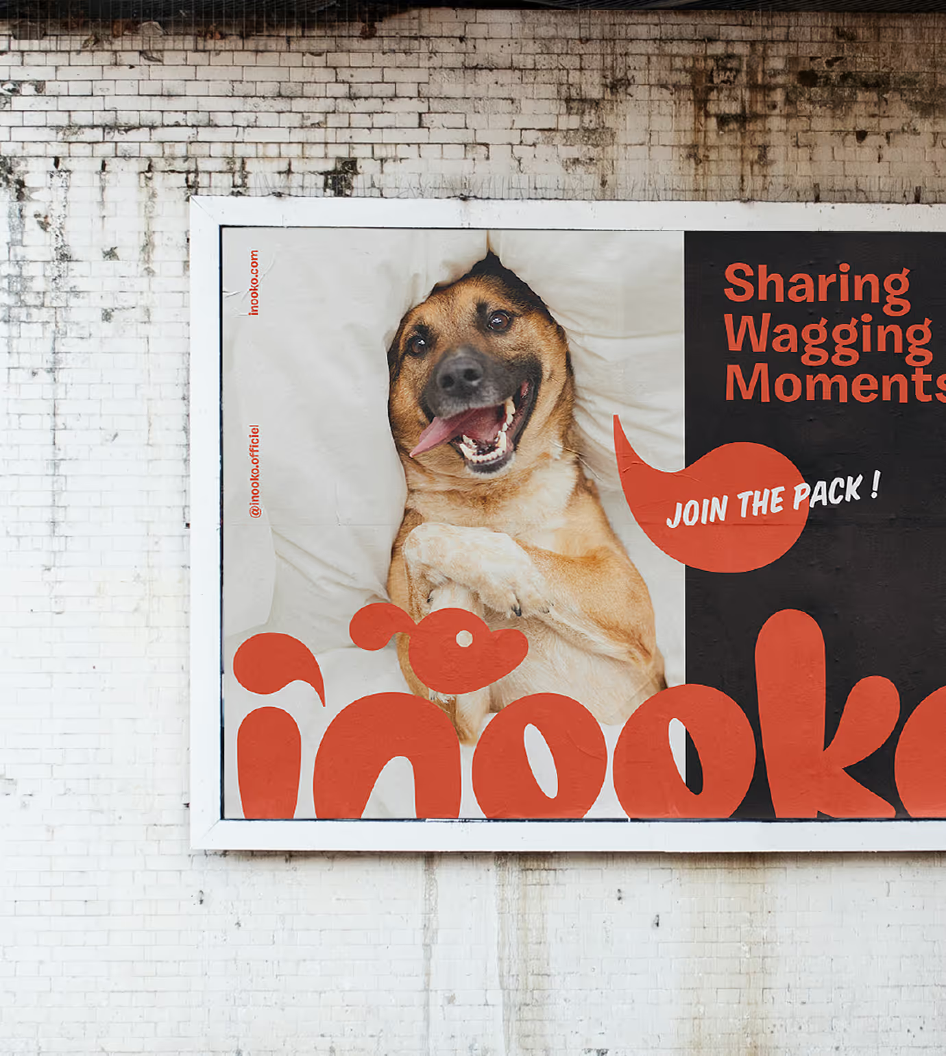
A refresh to the French pet and lifestyle brand, inooko. The name itself is a playful mash-up of the Japanese words “inu” (dog) and “neko” (cat), a linguistic foundation that informed the entire visual identity direction. When Inooko engaged us for an identity refresh, the goal was clear: create a distinctive, memorable wordmark logo that captures both the brand’s European sophistication and the affectionate spirit of pet culture
Client
Inooko Identity
Services
Creative Direction
Brand Identity Design
Animation
Year
November
2022
Links
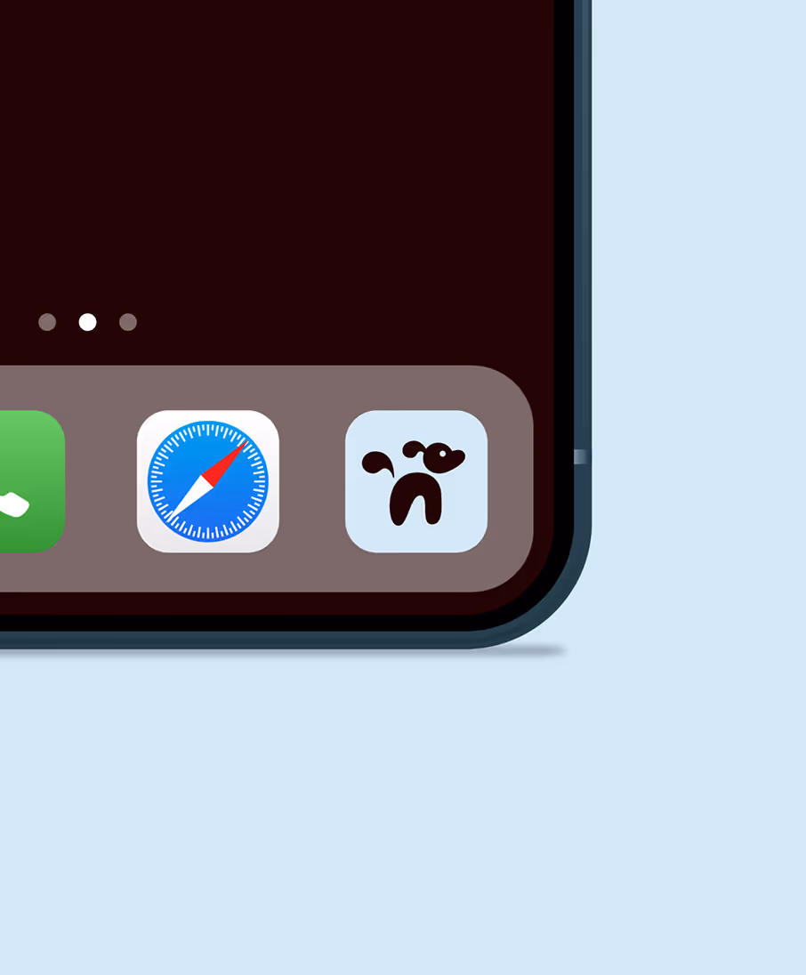
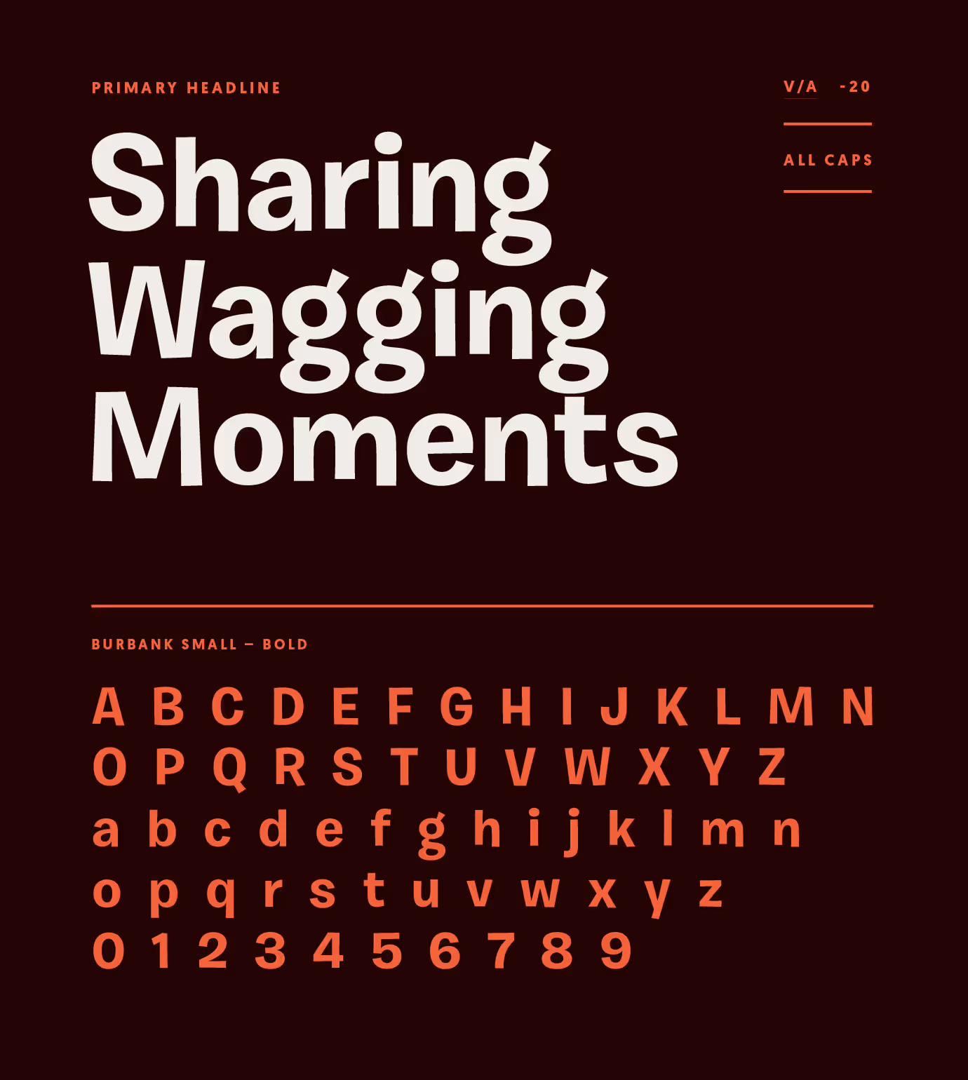
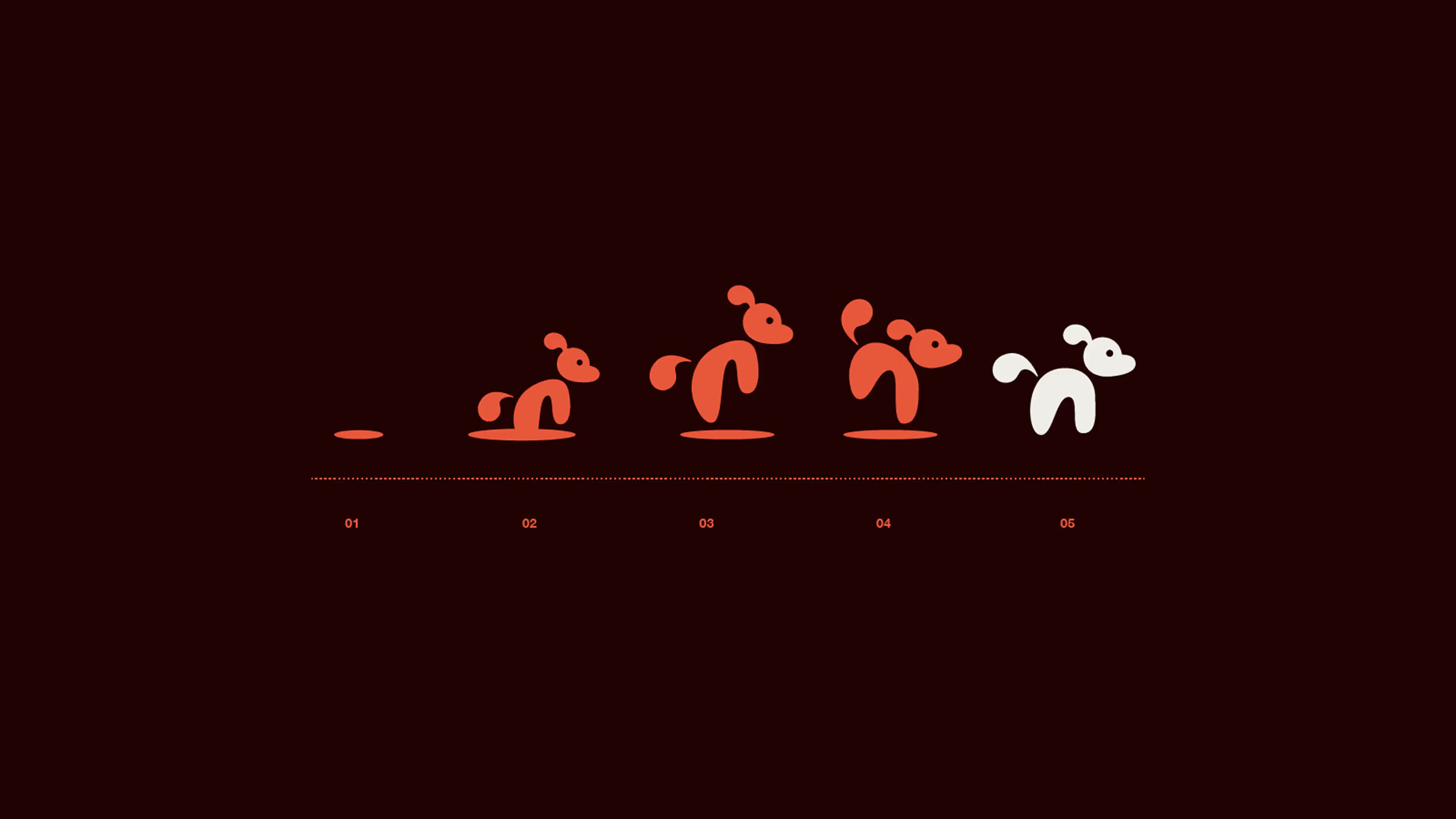
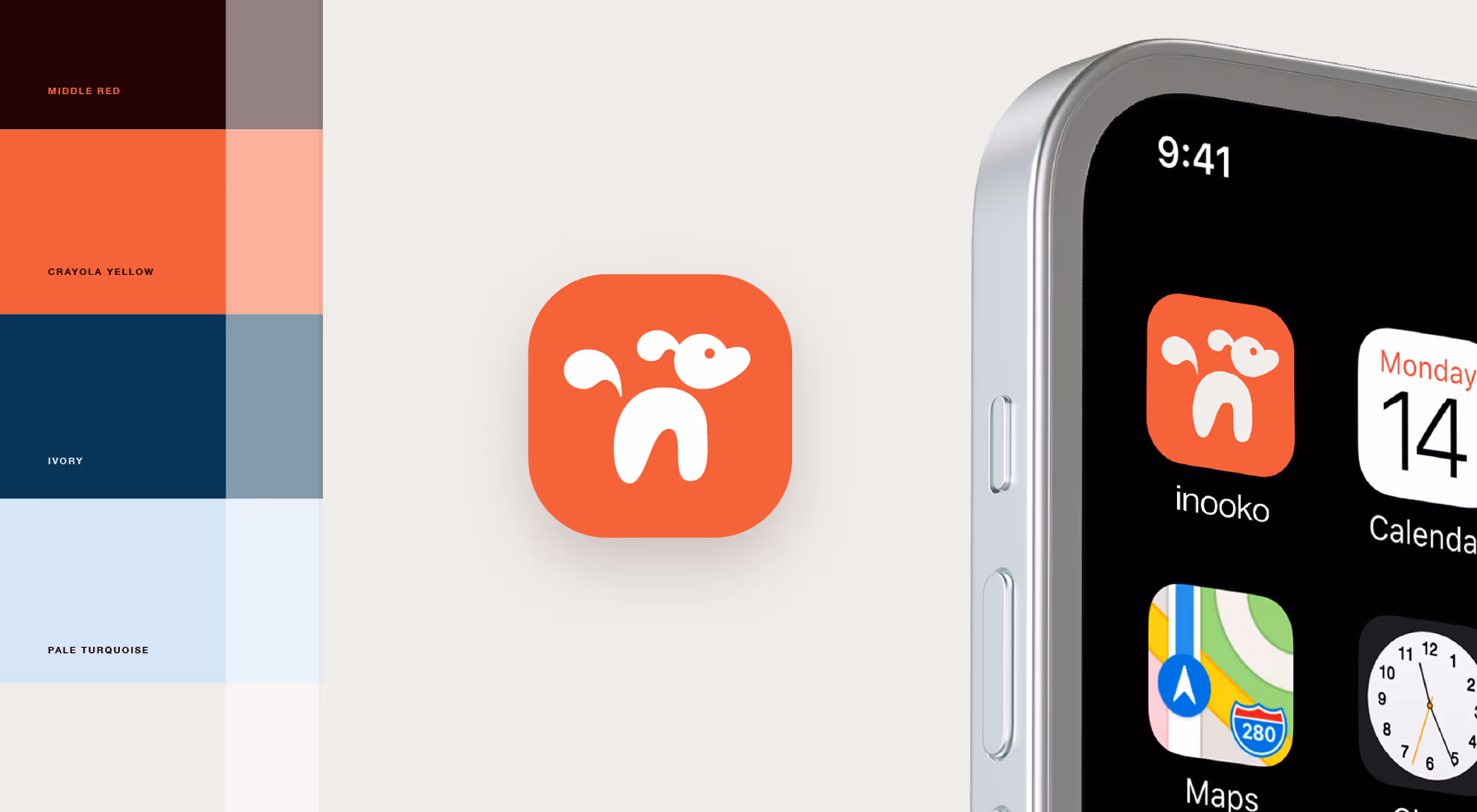
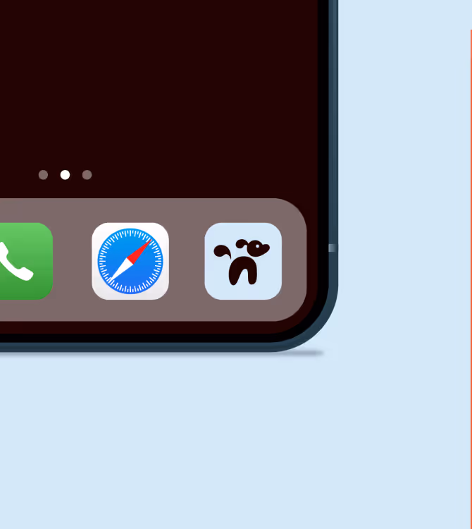
We explored a wide range of hand-lettered styles and aimed to incorporate a subtle nod to the pets we love. The final wordmark can be reduced to an iconic pet silhouette, supporting responsive logo use on social, mobile, and micro-interfaces.
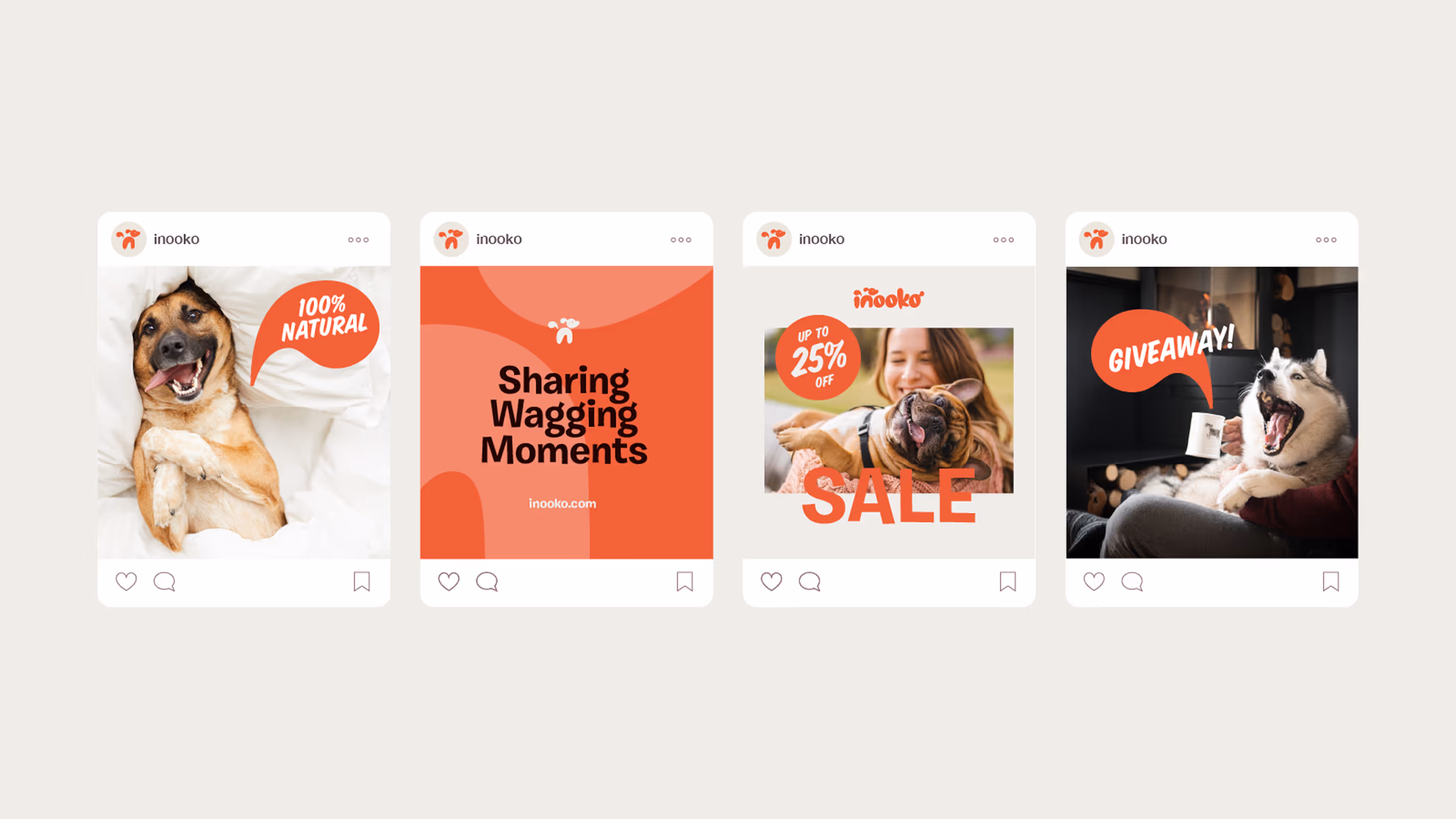
Pulling the tail shape from the logo, we created a repeatable visual, intentionally shaped to resemble a speech bubble — a subtle visual cue that brings the brand’s personality to life. This subtle detail quietly suggests that Inooko’s pets have a voice.
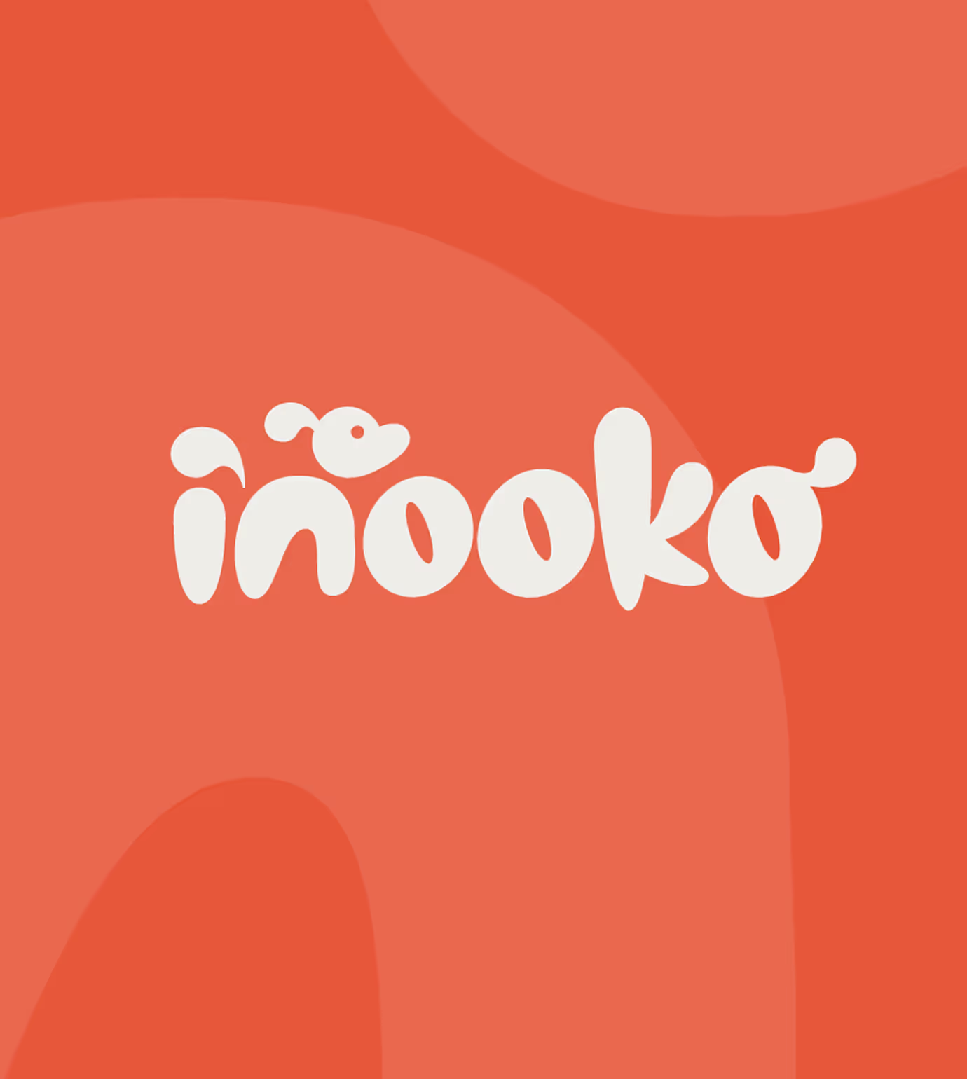
The Wordmark
The final Inooko wordmark is a hand-drawn custom logotype tailored to the brand’s voice
Personality
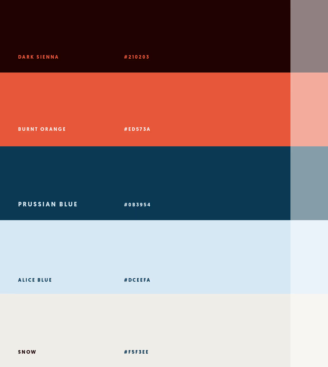
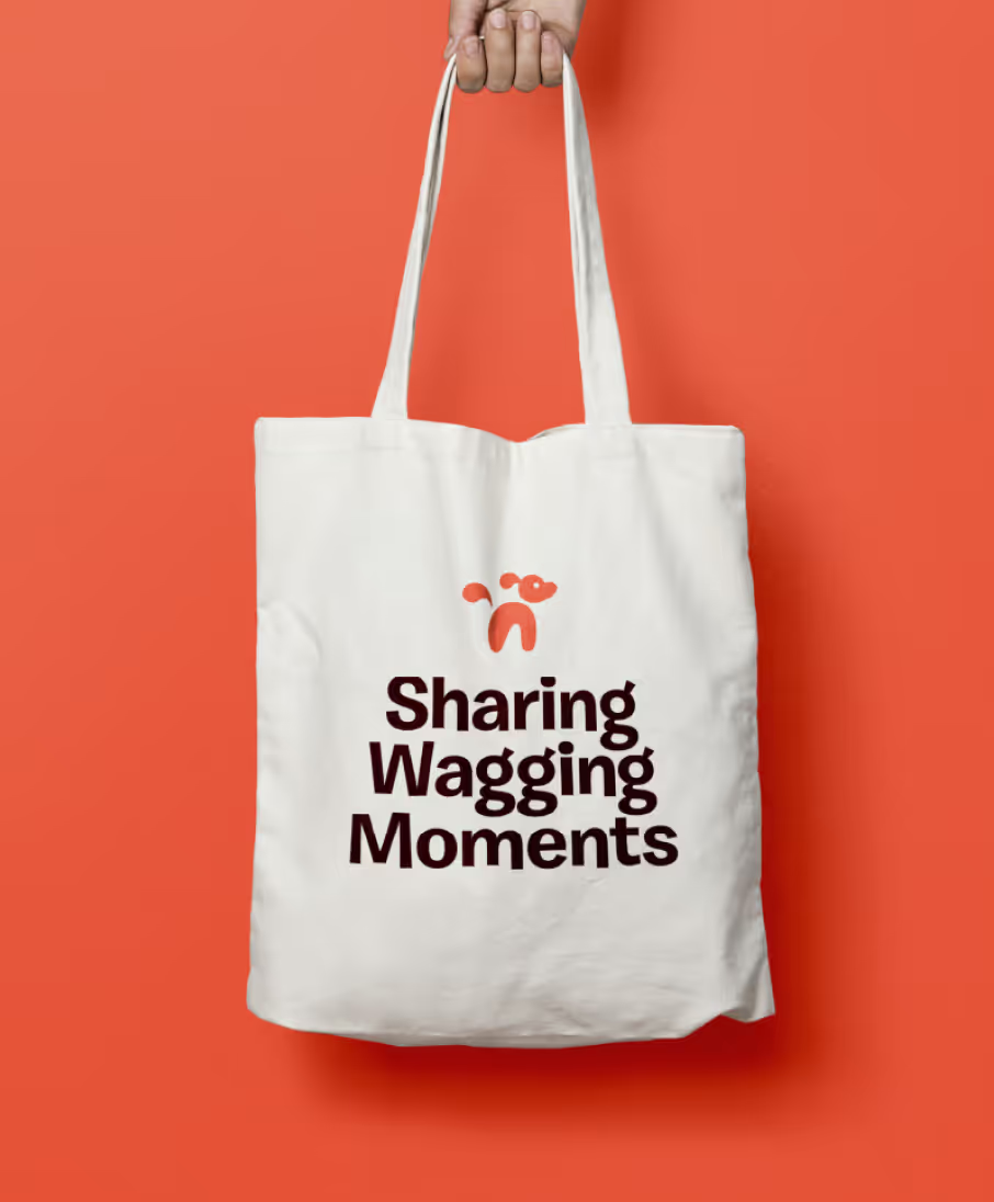
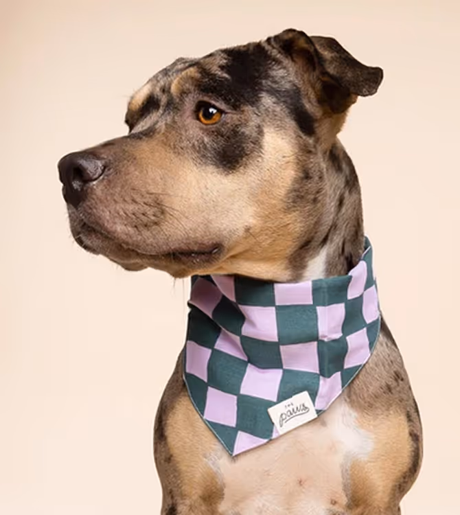
We introduced a reimagined color palette imbued with warmth and personality — hues chosen to feel inviting without overpowering, aligning with both lifestyle and pet-centric applications.