
Dip Devices Identity
Dip Devices — A bold identity built for portability, discretion, and next-generation consumption
Let’s Connect
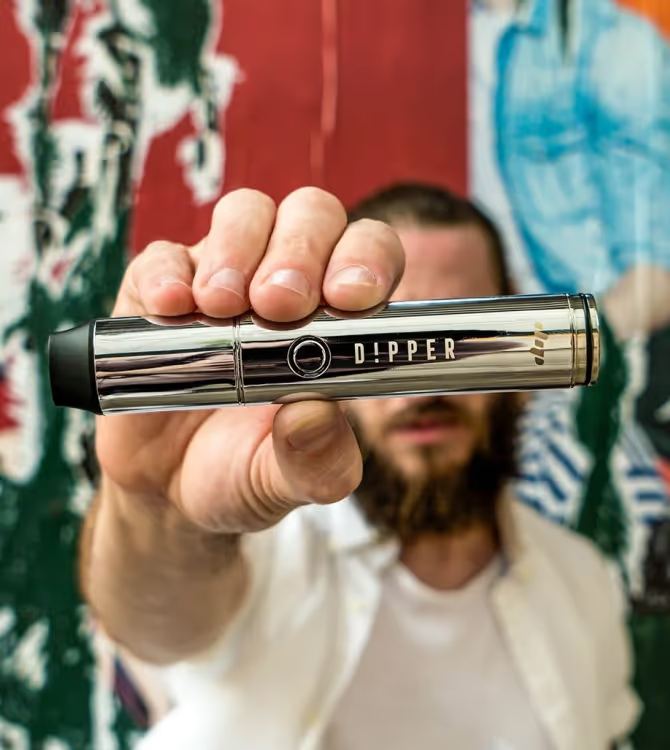
Dip Devices is a consumer product brand creating compact, discreet devices designed for modern smoking and concentrate use. Operating at the intersection of lifestyle, technology, and cannabis-adjacent culture, the brand needed a visual identity that felt confident, contemporary, and unmistakably product-driven—without leaning into dated stoner clichés or overly medical aesthetics.
Client
Dip Devices
Services
Creative Direction
Brand Identity Design
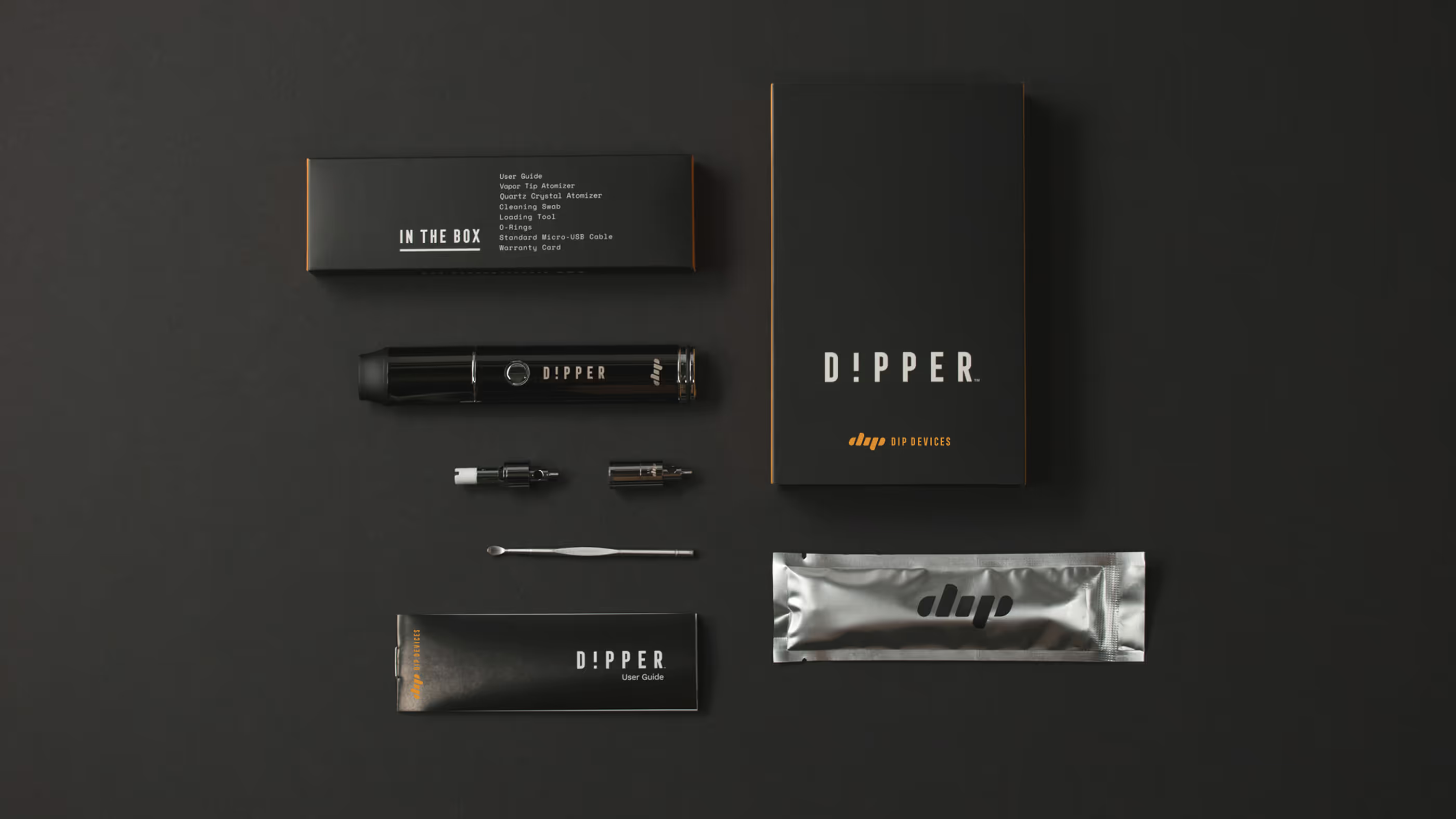
Product Packaging
Photography
Iconography
Year
January
2018
Links
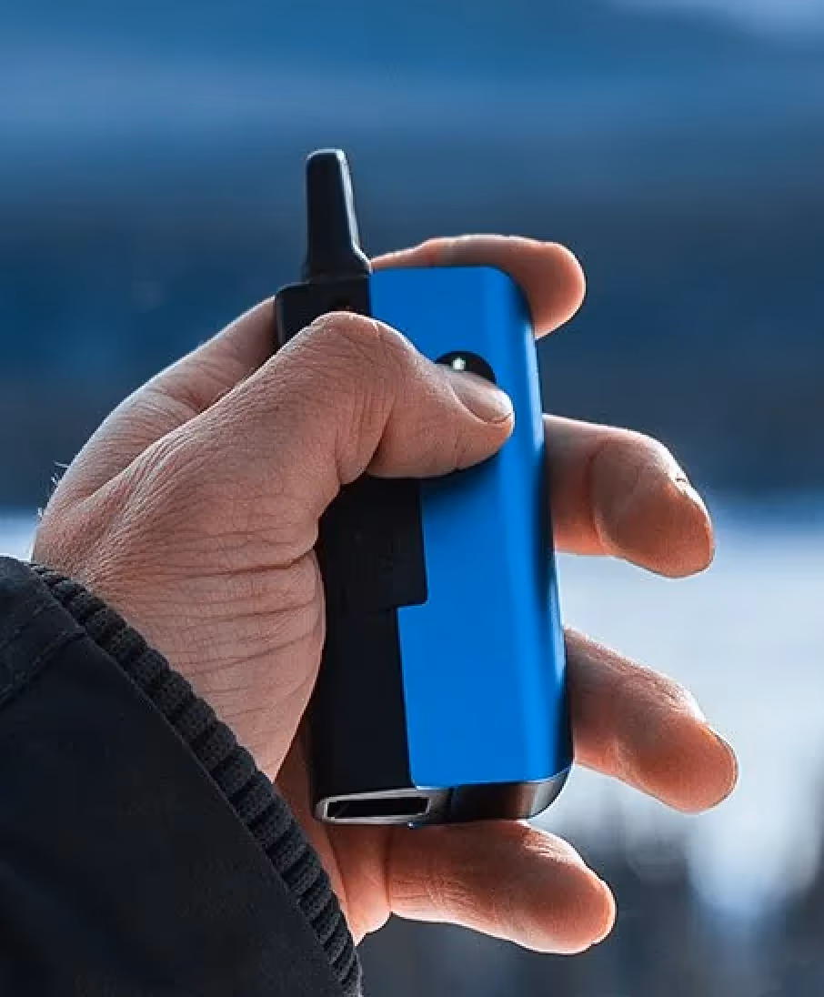
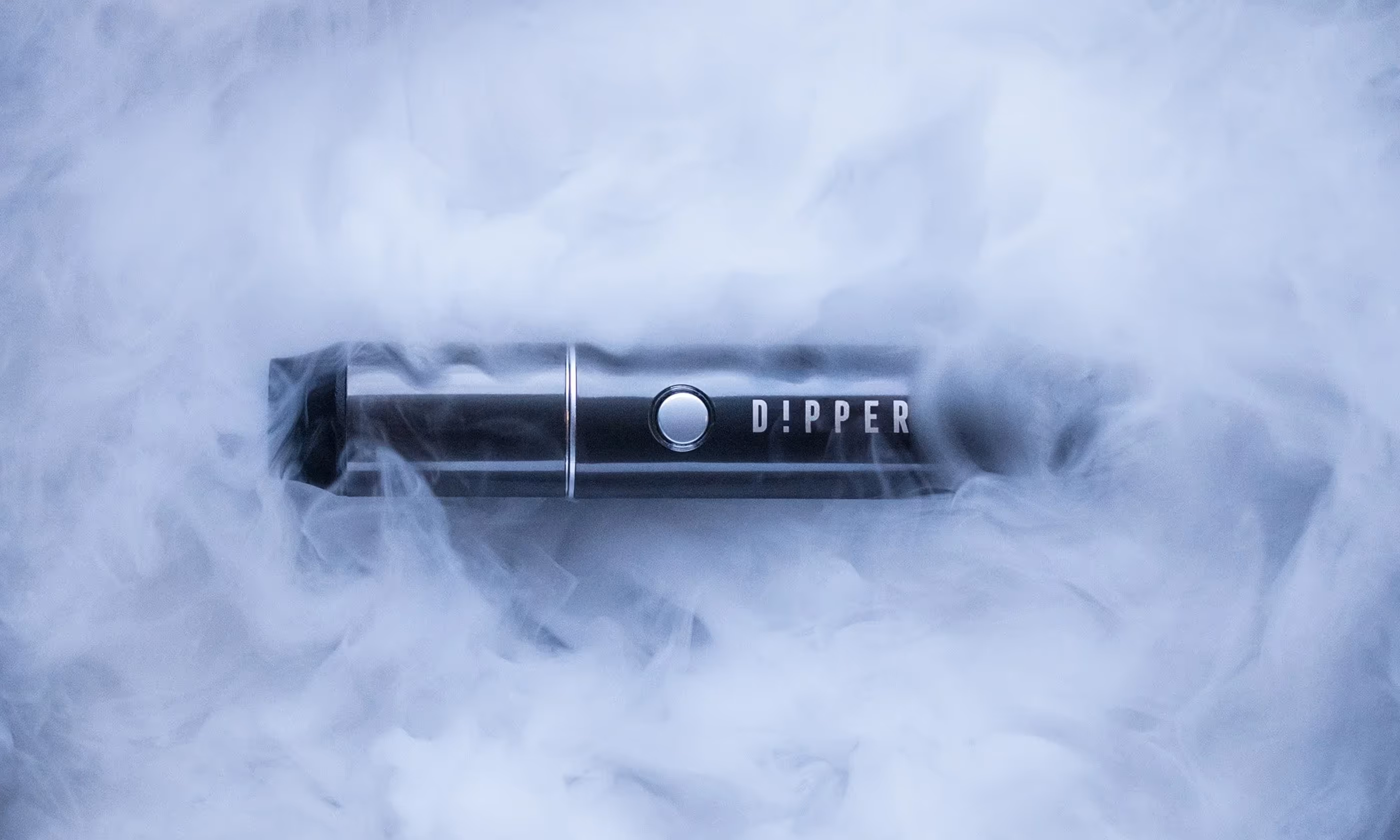
The new ambigram logo, clean aesthetic, and macro photography helped the brand find its vision and make a splash in the cannabis vaporizer industry. The packaging reflects the company’s focus to demystify and normalize cannabis concentrate consumption in the US.

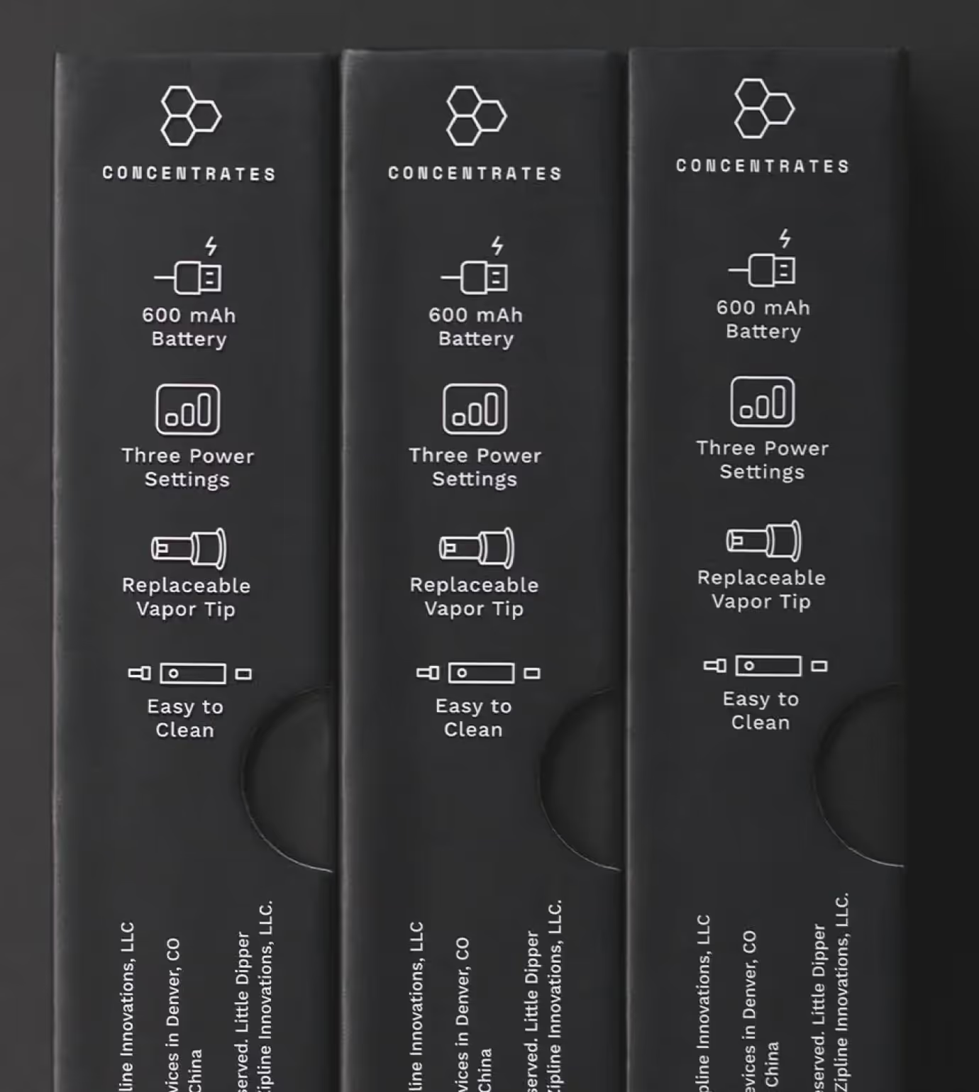
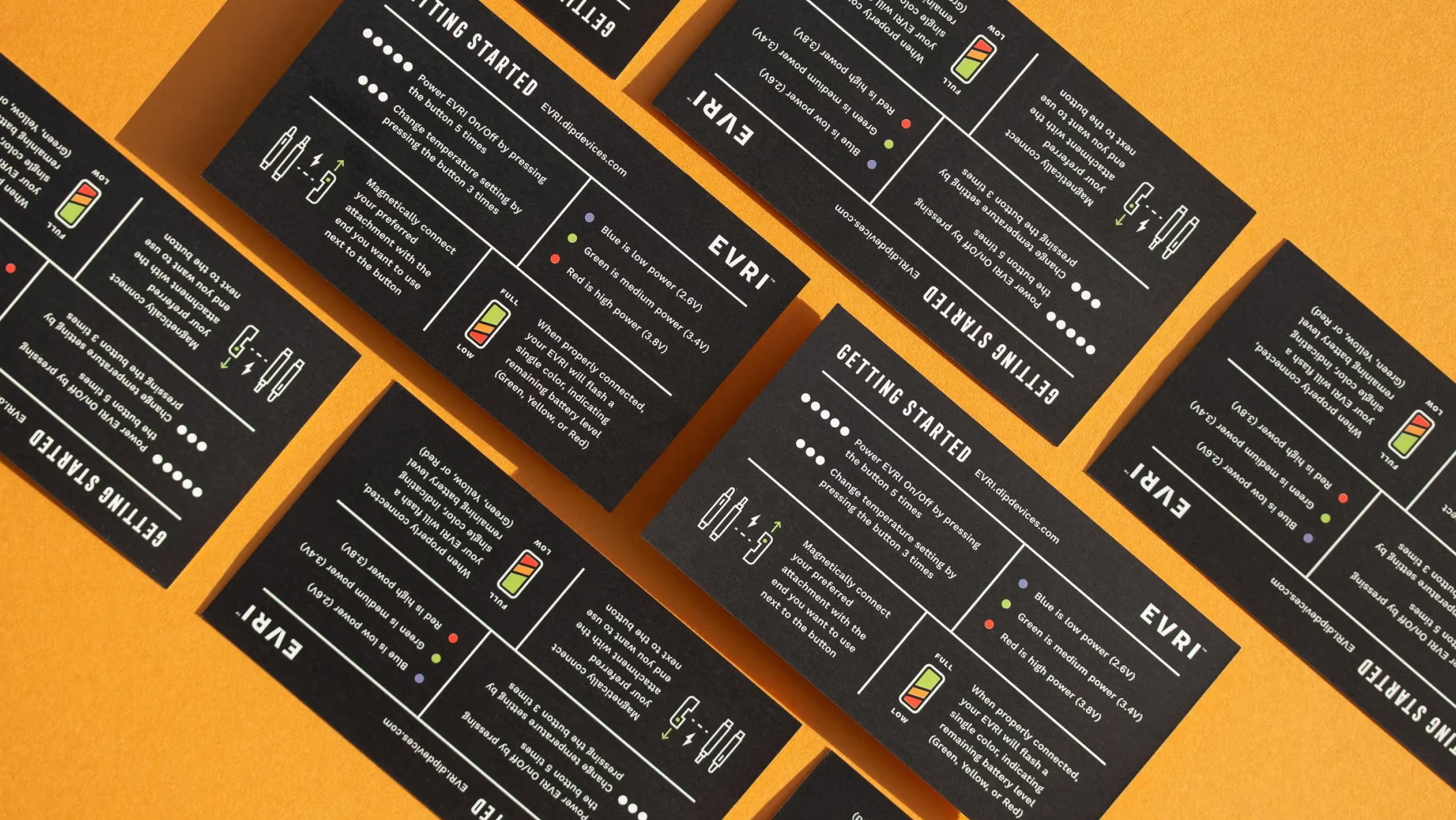
A significant portion of the Dip Devices packaging and marketing materials was intentionally designed to educate consumers, particularly around cannabis concentrates and proper use. We leaned into infographics, custom iconography, and clean, structured layouts to make information easy to scan and understand.

Concept
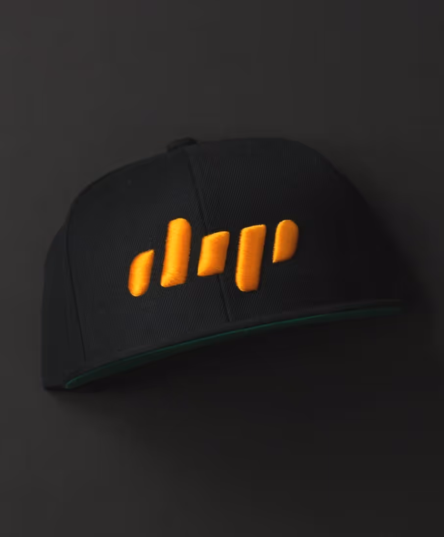
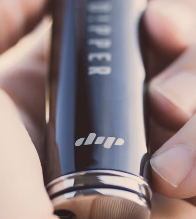
Originally called “Dipstick,” the DIP wordmark is formed from five sticks, with the outer elements symbolizing a cannabis concentrate drop.
Visual Language
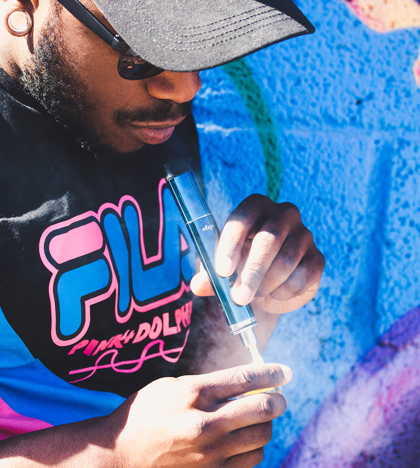
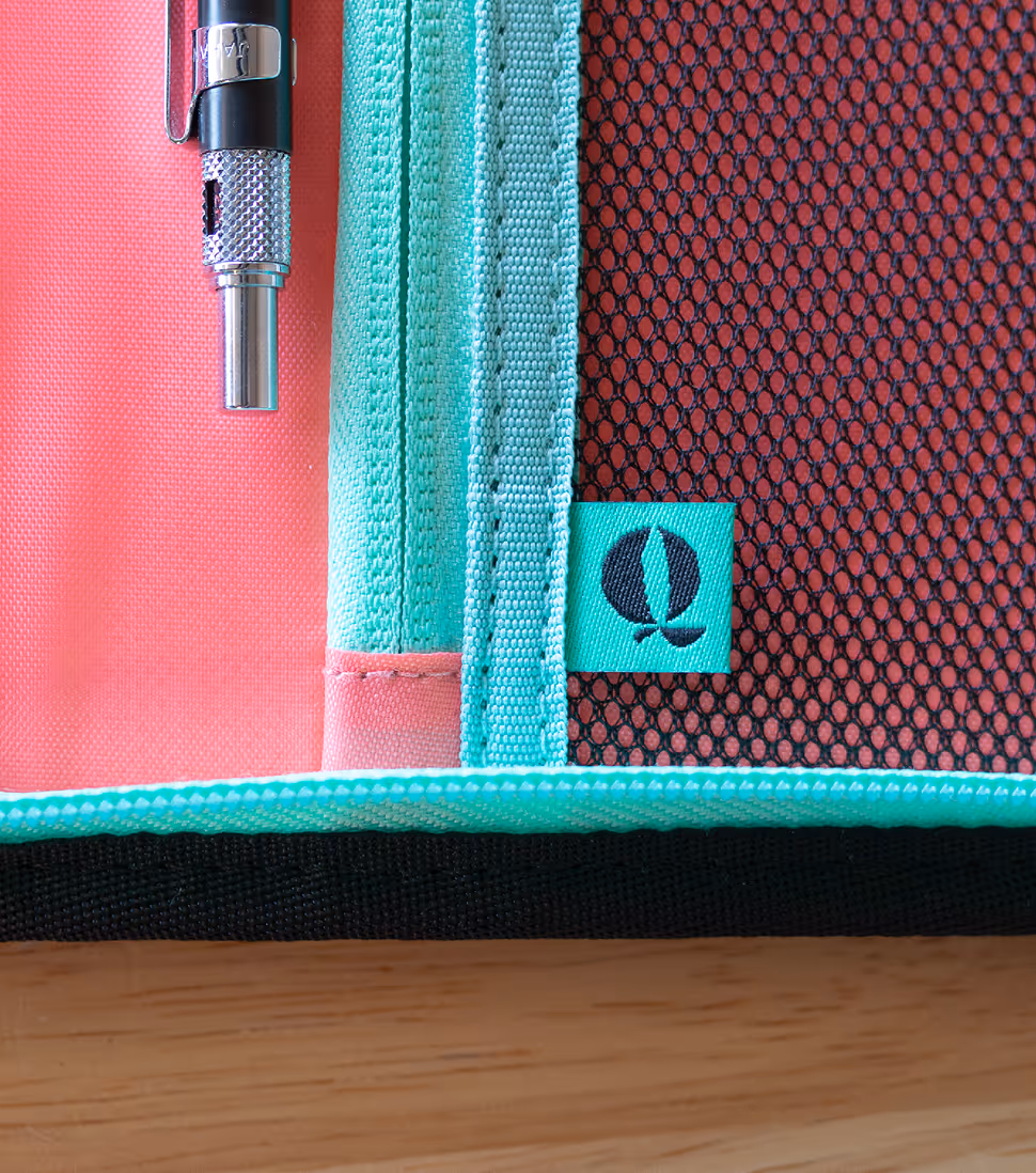
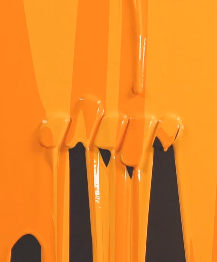
We leaned into macro photography and abstract liquid concentrate visuals to elevate the brand, moving away from traditional stoner-centric smoke imagery.