
DailyBasis Identity
DailyBasis — A thoughtful identity built around daily ritual, hormonal rhythm, and informed support.
Let’s Connect
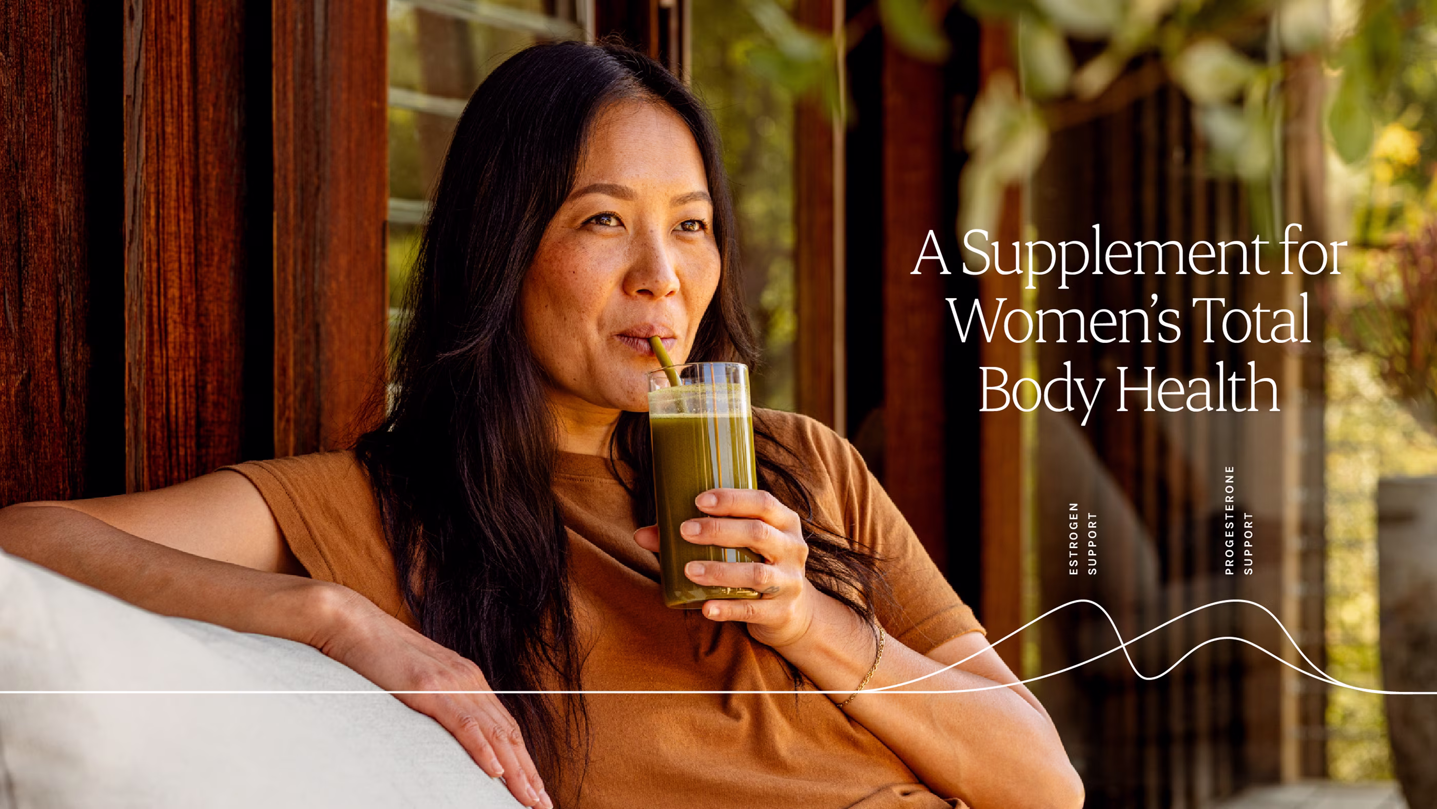
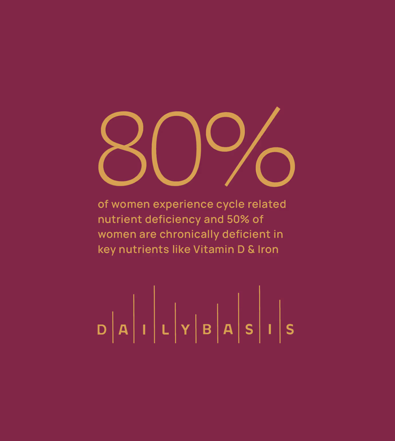
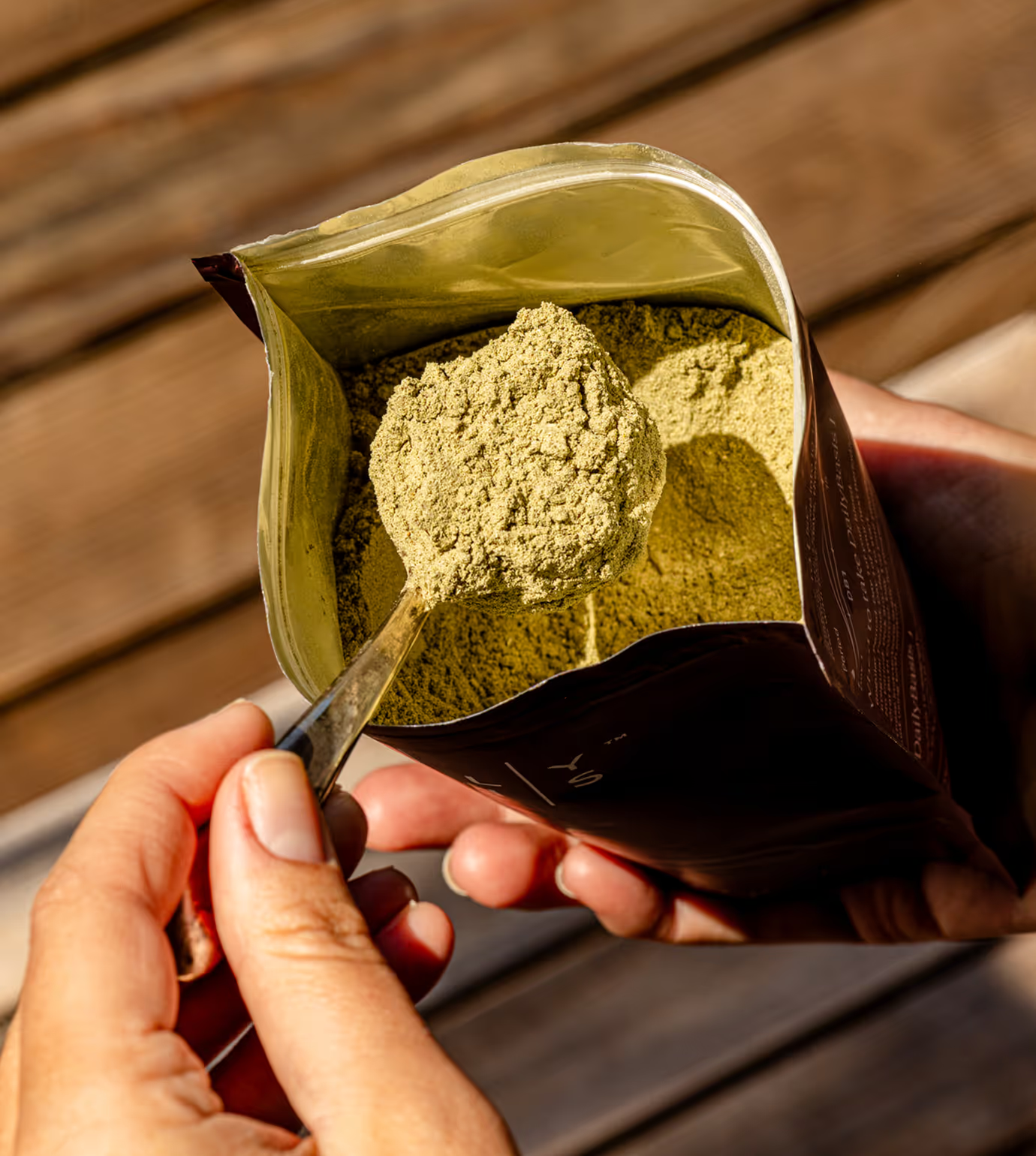
DailyBasis is a women’s health supplement brand focused on supporting hormonal balance through intentional, phase-based nutrition. Rather than offering a quick fix, the brand emphasizes daily consistency and replenishment. The identity was designed to reflect this philosophy with an educational, empowering, and credible approach that avoids common clichés in the women’s wellness space.
Client
DailyBasis
Services
Brand Identity Design
Packaging
Web Design
Year
April
2024
Links

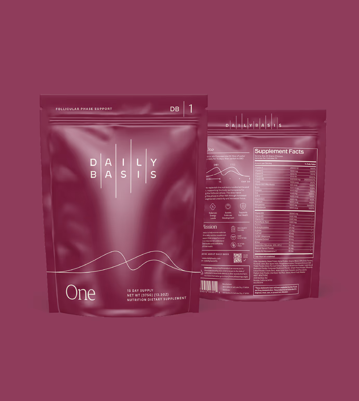
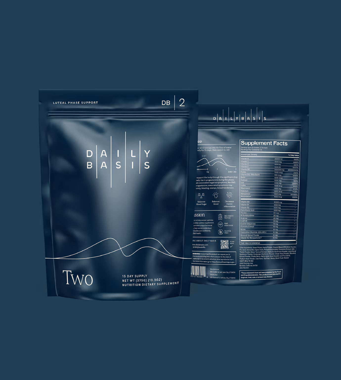
The DailyBasis logo was created as a direct nod to the daily ritual of taking supplements in support of women’s health. The vertical rhythm and line heights within the logo reference the natural rise and fall found in female hormone level graphs, visually reinforcing the cyclical nature of the product. This connection grounds the brand in biology and routine.
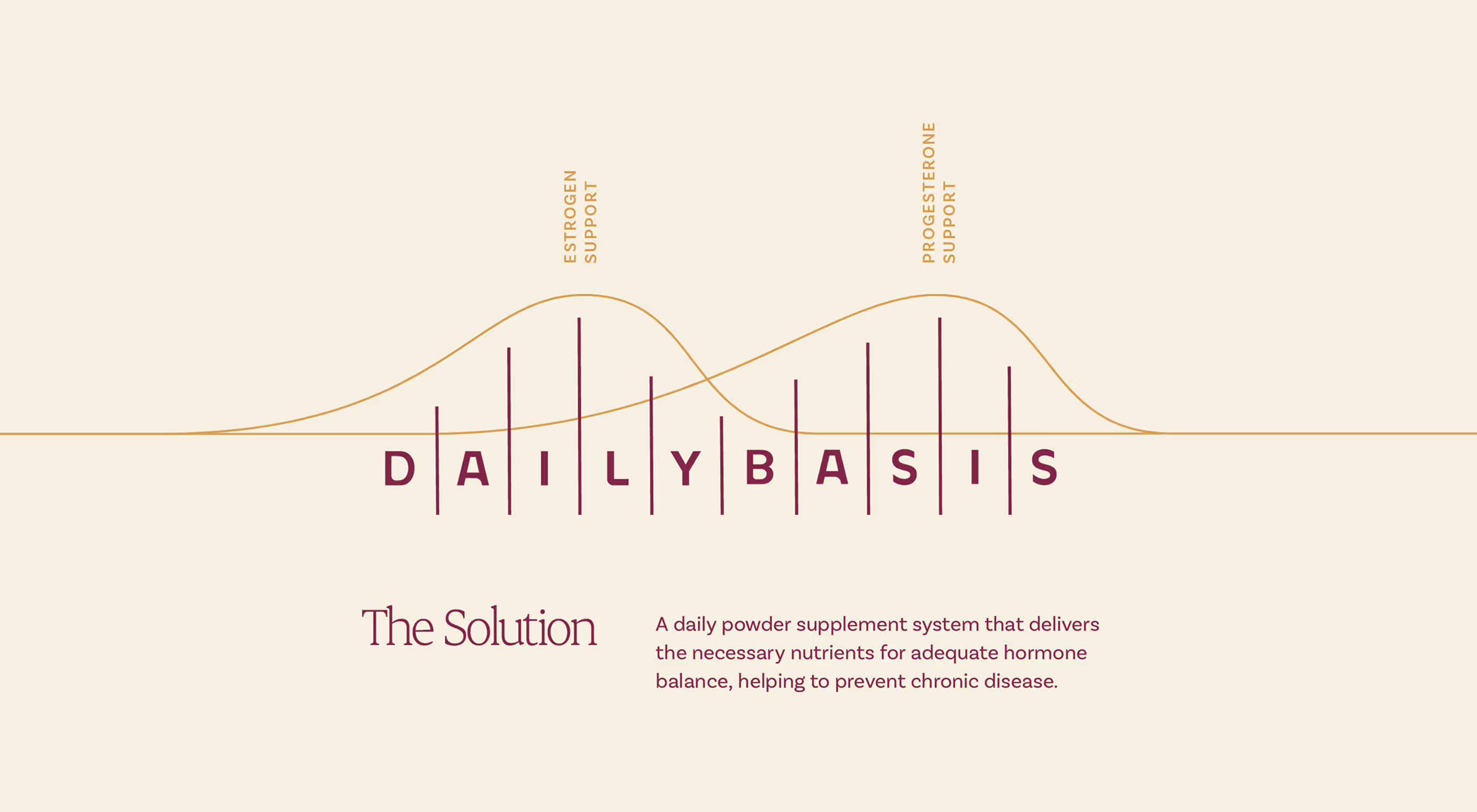
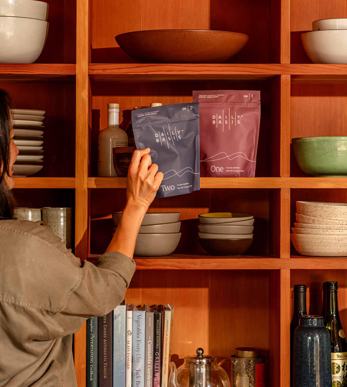
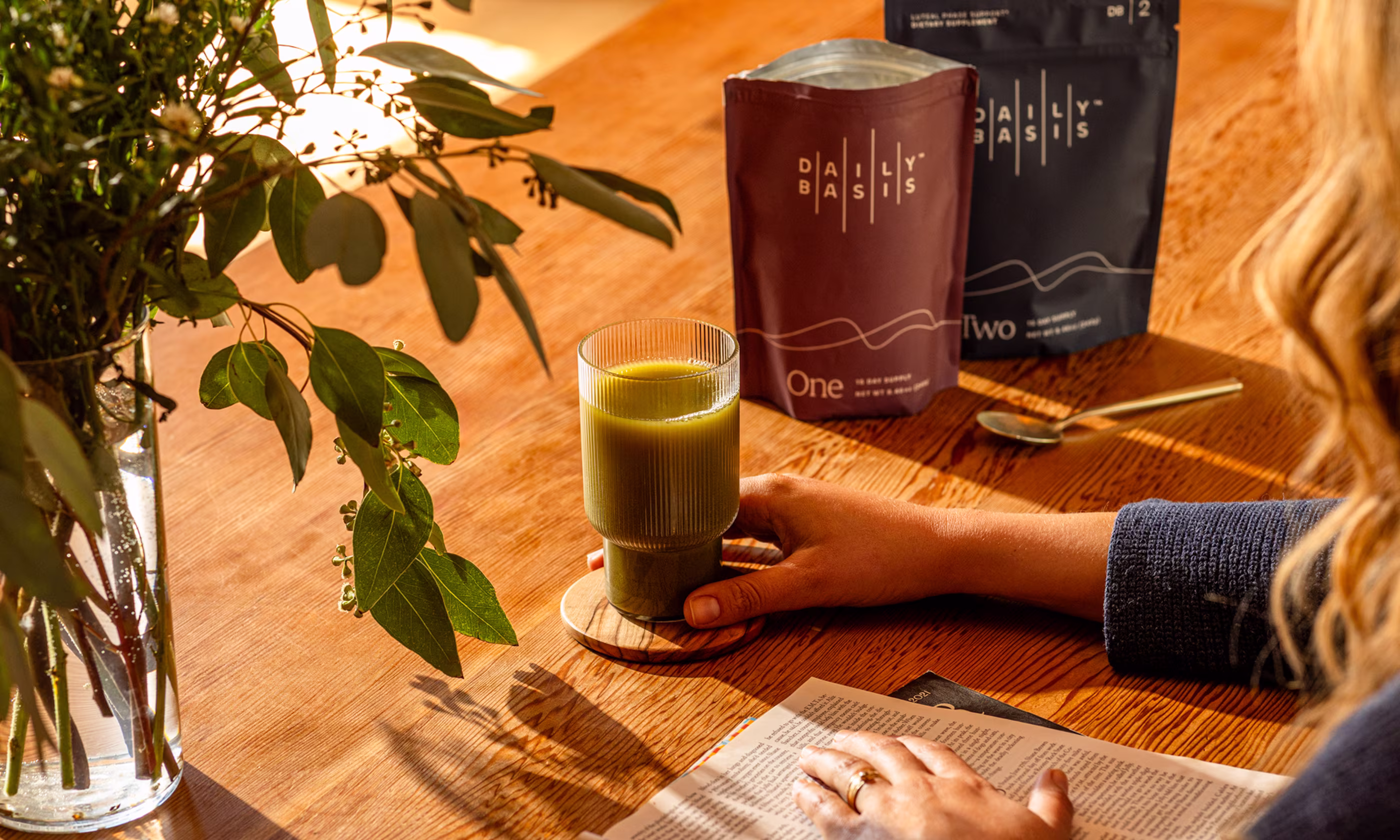
The packaging was designed as a two-part system that reflects the brand’s phase-based approach. We leaned into a palette of deep jewel tones to convey depth, confidence, and care, offering a feminine presence without defaulting to predictable pinks or purples.
Iconography
Education is central to DailyBasis’s mission, so we created a custom icon set to make information easy to understand.

Visual Language
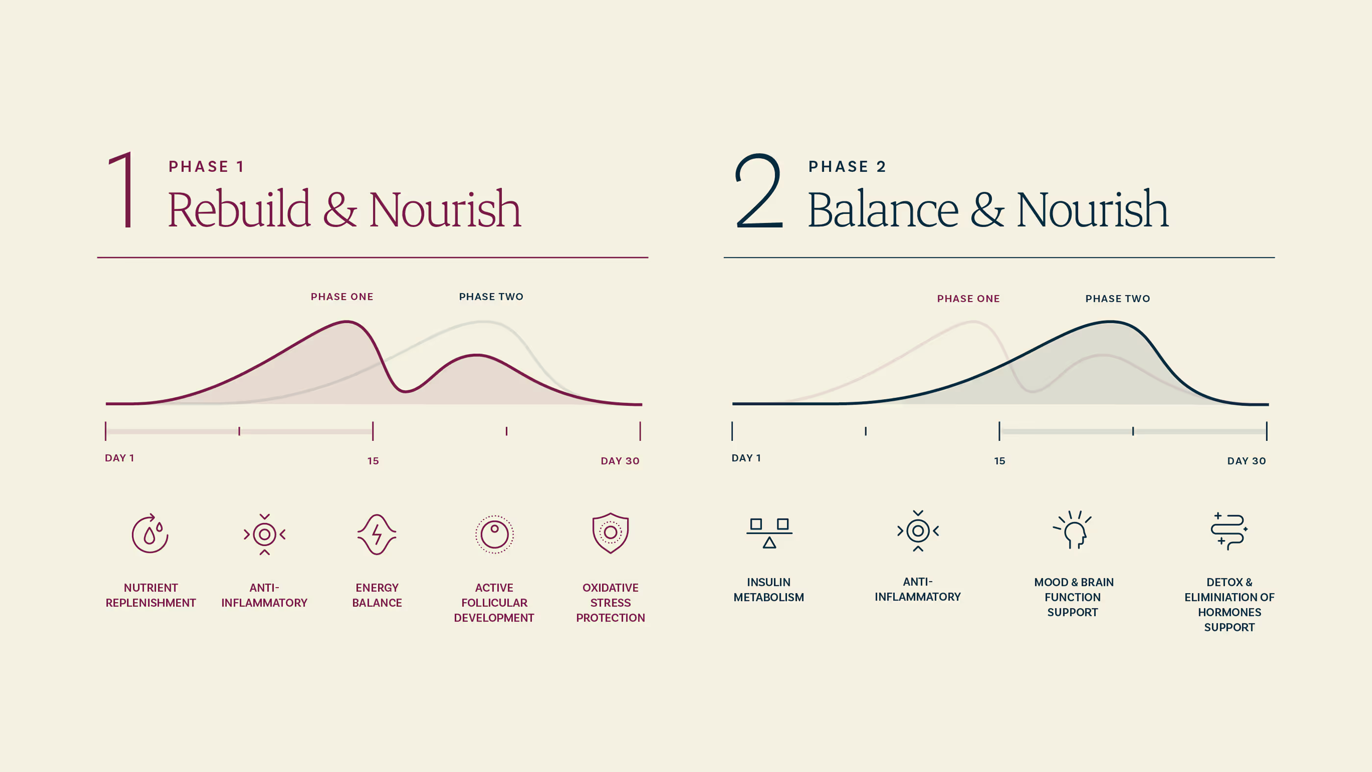
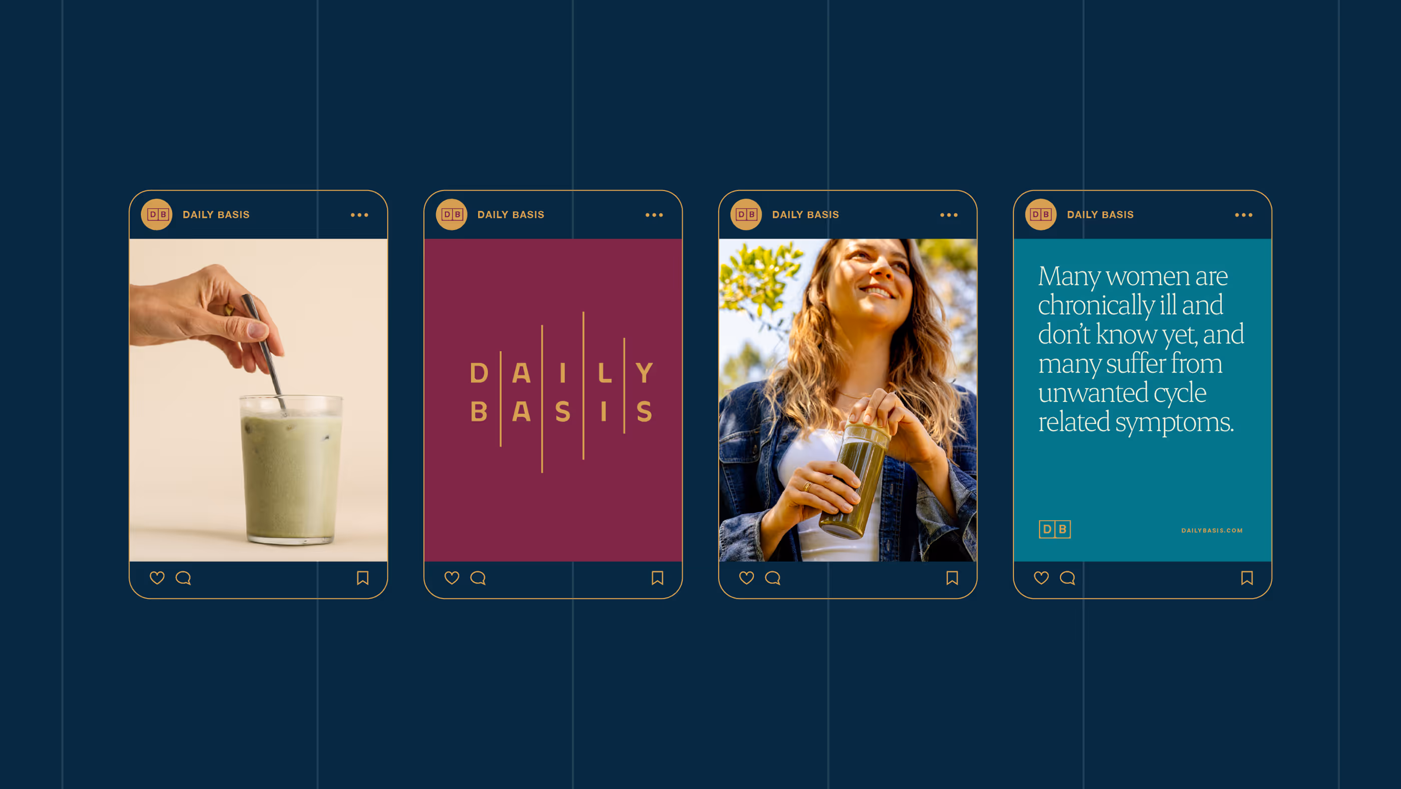
To tie the system together, we leaned into the hormone graph lines and use them as a recurring visual motif across packaging and collateral.