Refreshing the Shift Cannabis Wordmark

The Logo Redesign Process
I was originally approached by the A Vital Few team for a collaboration to refresh the Shift Cannabis script wordmark. The company was in the process of a full brand overhaul but was determined to retain the strong brand equity of their current orange wordmark. We worked closely with the team to first audit their current logo, and then refine all aspects of the type to give them a strong foundation for the brand moving forward.
To begin the process, the first step was to do a thorough audit of their original logo mark.
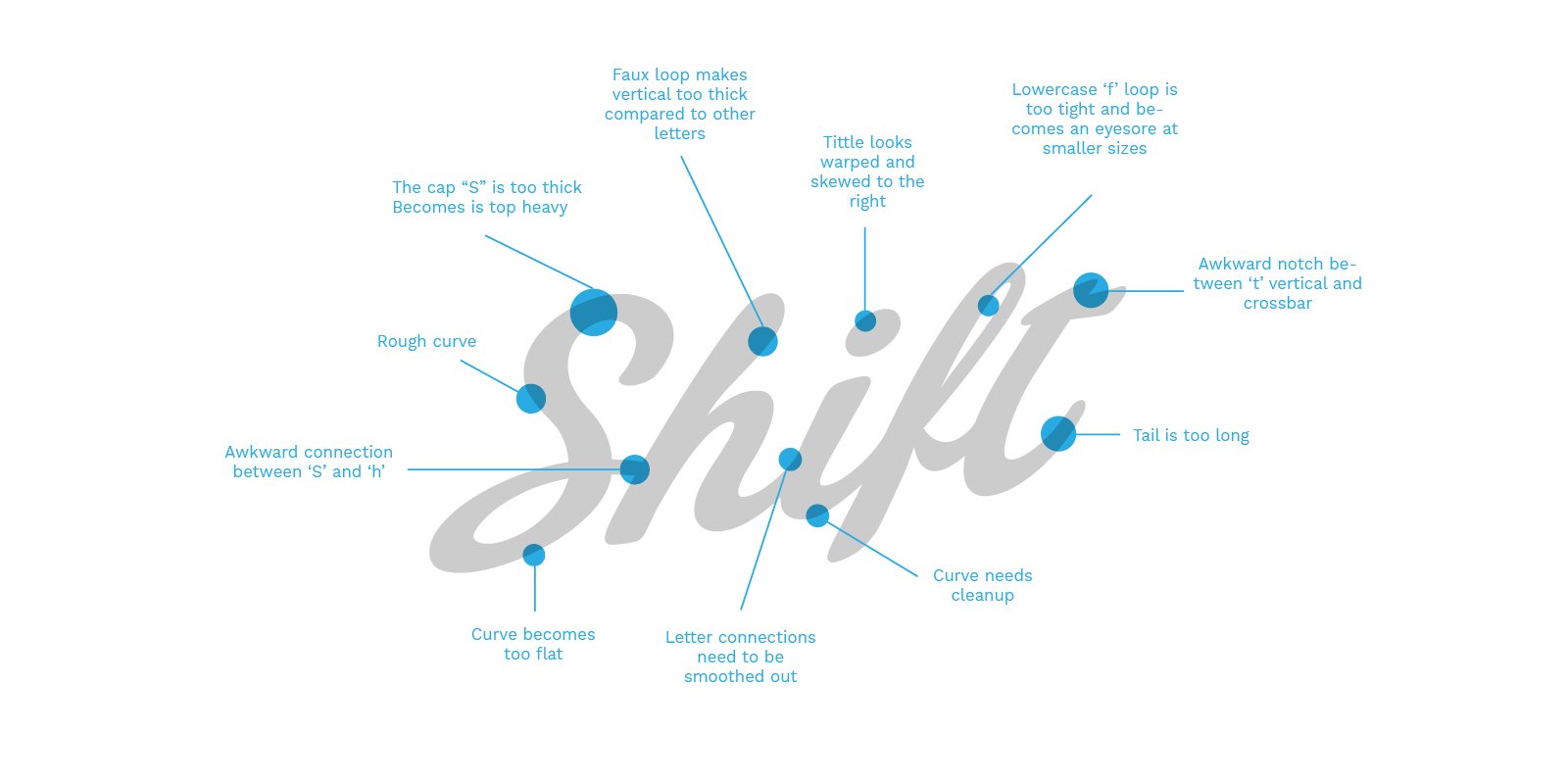
Inconsistent Letter Slant Angles
The inconsistencies of the letters’ vertical elements become very apparent, especially in shorter words. The lack of uniformity makes the word mark feel sloppy and unrefined.

Uneven Letter Spacing
Spacing between the letters should vary to give the optical illusion of even letter spacing. The kerning in the original mark starts loose and gets too narrow and tight between the ‘ift’.
Hand Lettering Logo Discovery
After the initial audit, we moved into our discovery phase. Since we were not starting from scratch, the discovery phase consisted of exploring subtle tweaks to the existing “Shift” letterforms. We went back to the drawing board and used a variety of brush tip pens to emulate the same hand lettered flow of the original Shift Logo.
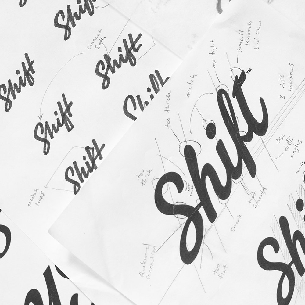
Through the hand lettering process, we created a smoother hand drawn ‘S’ with more movement and a better flow, removed the awkward ‘Sh’ ligature, and removed the faux loop from the ‘h’ ascender for more consistent letter weights. From our initial review, we knew we had to adjust the letter kerning to be more consistent. A new more angled tittle over the ‘i’ better matched the sharper letterforms. By opening the ‘f’ loop, and thickening the upward stroke, the “f” becomes less delicate and has better legibility at small sizes. We also moved the crossbar of the ‘t’ down to the appropriate height which makes the ‘t’ less top heavy.

Additional Letterform Options
Seemingly minute details can make or break a brand mark. The capital S in “Shift” plays a major role in setting the tone for the symbol. The original S felt forced and unnatural, so the goal was to create a much more fluid stroke.
By using a large soft tip brush pen, we explored many variations of the ‘S’ while holding onto the essential shape.
Another element we explored is the connection between the ‘f’ and ‘t’. The original type didn’t utilize a ligature between the two letters, so we worked on a few variations to give this connection a smoother flow.

Final Wordmark Logo Revisions
This refined logotype aims to combine successful elements from all phases of the project. The x-height matches that of the original logo, and the letter kerning adjusted to create an even flow.
The slant of the type is slightly reduced, most similar to the original. We included the free-standing S, and flattened the ascender and descender terminals to give the type a more classic and timeless look.
While a departure from the original rounded type, we believe that these updates will give the brand a better platform to stand on, and the design aesthetic will remain relevant for much longer.


Are you in need of a
Wordmark Logo Design?
Whether you are looking to create a new wordmark logo, custom logotype, refresh an existing mark, or just shoot the breeze, I would love to talk success with you!